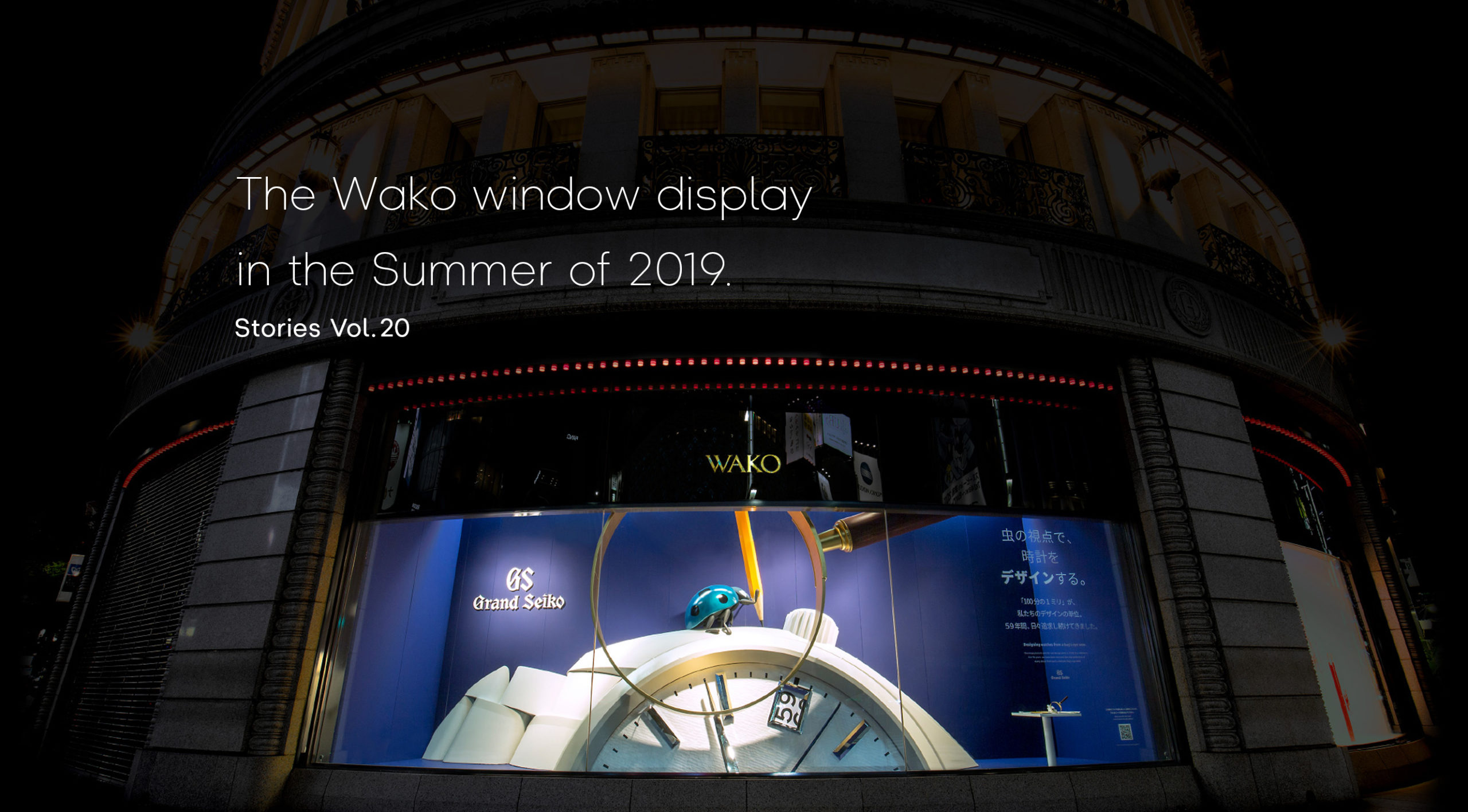
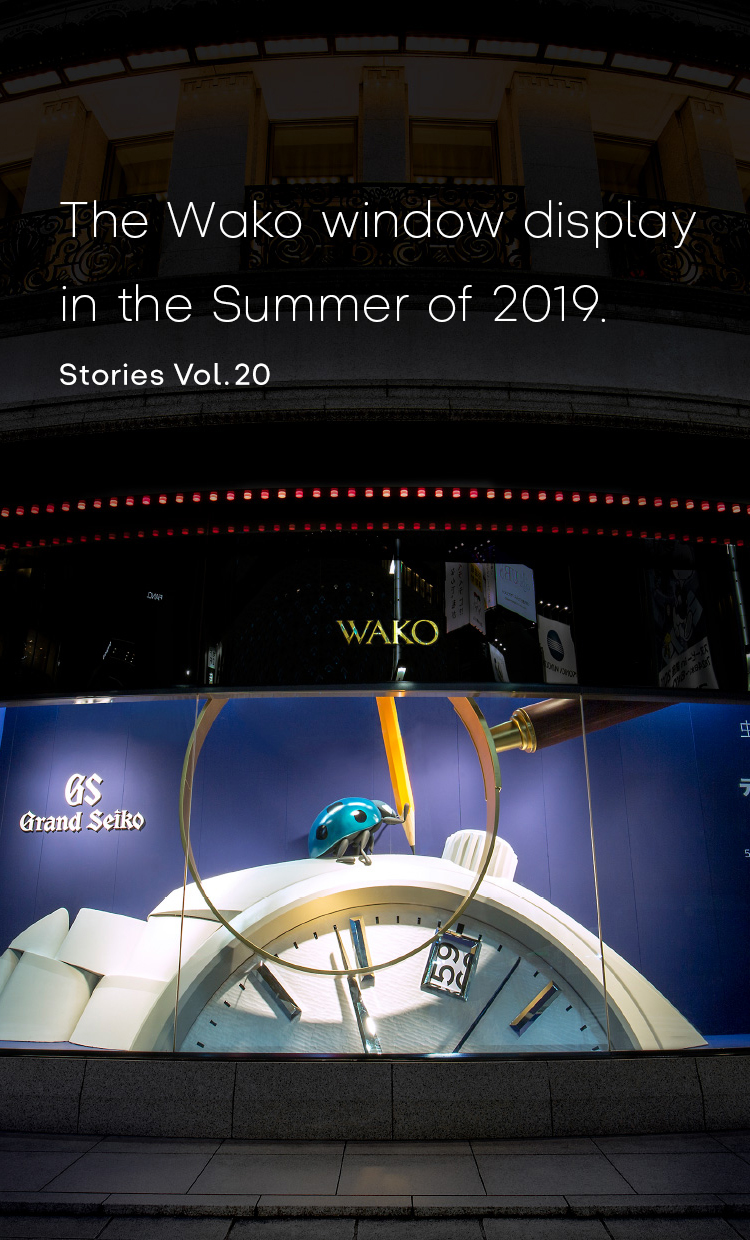
Expressing a “bug’s-eye view” at the center of Ginza in the Summer of 2019.
In August 2019, an exhibit with the theme of the Grand Seiko was put on show in the display window of the Wako main building, one of the symbols of the Ginza district in Tokyo. The project had many aspects that differed from product design, which is our regular work. There were a lot of trials and errors and many lessons learned. Today I would like to talk about our efforts for this project.
Sakai joined Seiko in 2012 and has designed watches for the global market, and then for the Japanese market. Today, he is on the Grand Seiko design team.
Sakai joined Seiko in 2012 and has designed watches for the global market, and then for the Japanese market. Today, he is on the Grand Seiko design team.
A wide variety of exhibits have been presented in the display window of the Wako store over the years. Normally, the design of these exhibits is managed by the Design Planning Department of Wako Co., Ltd. No watch designer had previously been deeply involved in the design of exhibits, so in that sense, too, it was quite a drastic endeavor.
An in-house competition was announced in December 2018 to gather ideas within the Design Center Department and determine the design. At that time, it had already been decided that the theme would be the Grand Seiko. The Summer of 2019, when the exhibit would be displayed, was in the year preceding the 60th anniversary of Grand Seiko, so the project had the intent of building momentum toward the anniversary.
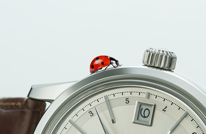
About 20 designers participated in the competition, and after giving presentations on three separate occasions, my idea won. The message of the design I proposed was Grand Seiko’s “careful attention to detail,” and the concept was “designing watches from a bug’s-eye view.” As described in Vol.1 of by Seiko watch design on this website, the measurement unit we use for designing watches is 1/100 of a millimeter. We create the design details with an intricacy that really is just like a bug’s-eye view.
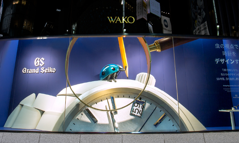
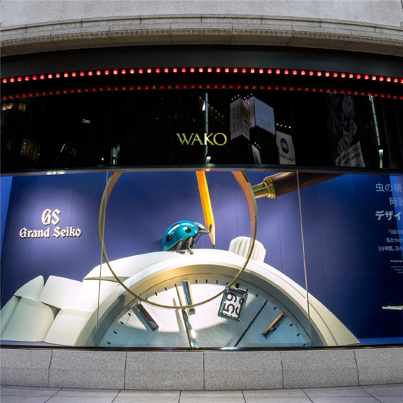
Specifically, the intent was to show how each and every part of the watch has meaning and is crafted with careful attention to detail—each of the hands and indexes beautifully cut by craftsmen, the delicate texture on the dial surface, and so on. The method I envisioned for conveying this message was to exhibit a giant Grand Seiko in the display window. The idea was that people looking into the display window could discover the detail of the product as if they had a bug’s-eye view.
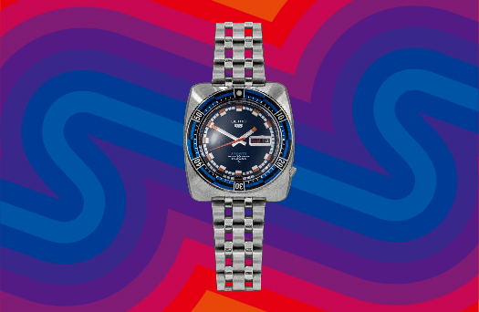
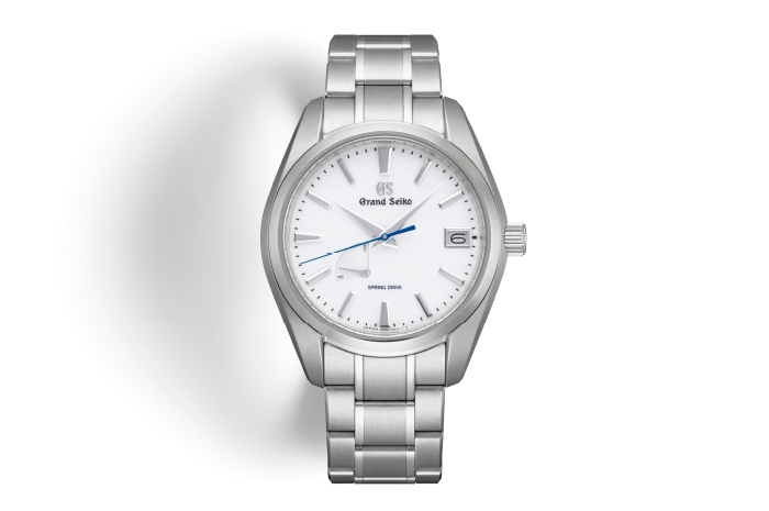
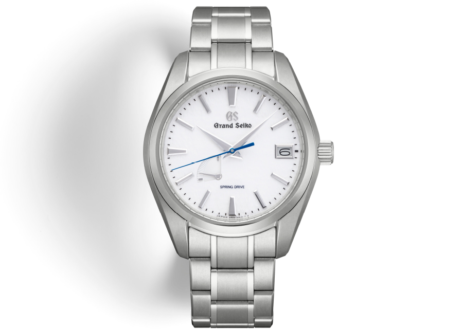
The model used for this project was the SBGA211. The feature of this watch is its pure white dial with a distinctive texture like windswept snow. This is one of the most popular models among Grand Seiko.
The design differences between the actual watch and the window display.
Based on the concept of the bug’s-eye view, the framework of the idea—to present an enlarged watch—had been determined. However, a lot of thinking and testing was required to decide how to achieve this. The first thing I wanted to do was to make part of the exhibit move. People walking around Ginza aren’t going out to look at display windows. In order to get them to stop and look, I thought a moving part would be effective.
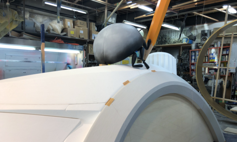
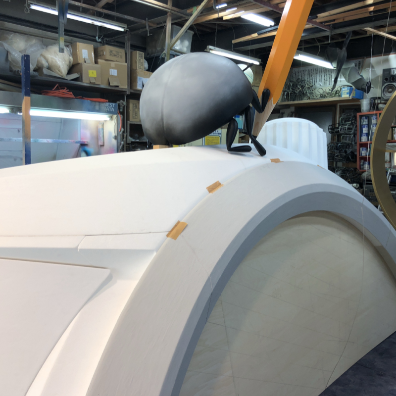
At first I wanted to have parts like the watch hands and calendar numbers moving, but after consultation, we found out that these were technically highly challenging. We eventually decided to incorporate a moving pencil held by a ladybug, representing a designer. In fact, during the in-house competition, instead of a ladybug, I had thought that a butterfly could be used, similar to one of the images included in the article for Vol.1. But a butterfly is unexpectedly uncomfortable when enlarged, so I abandoned that idea.
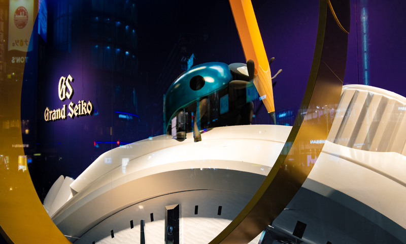
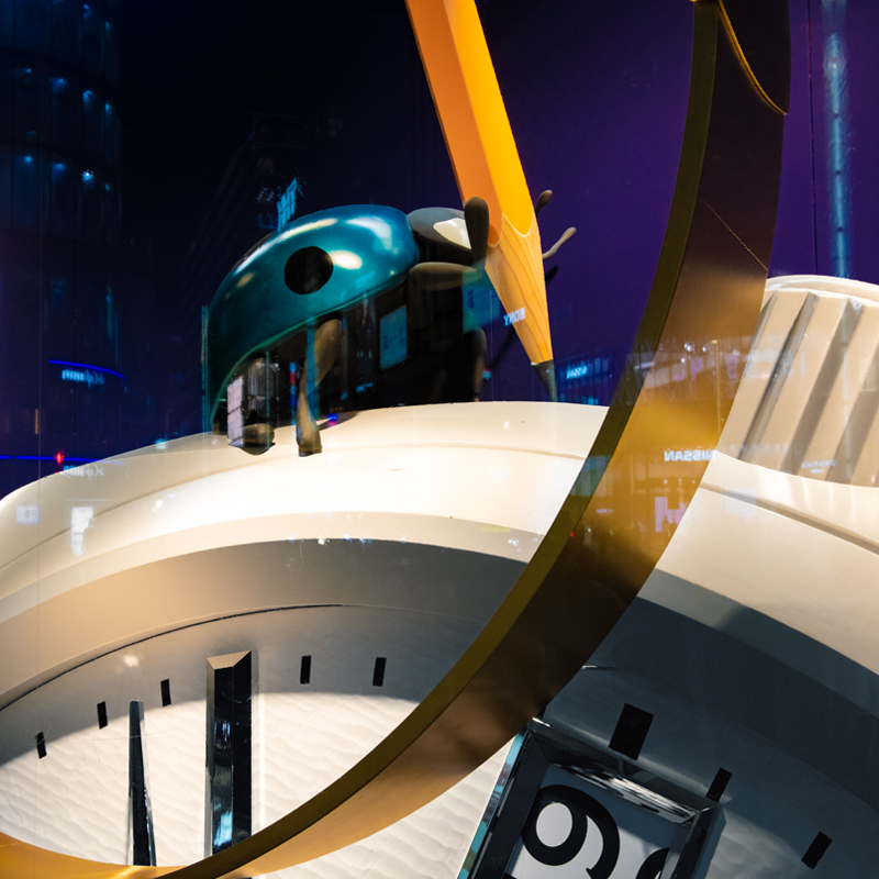
In addition, the ladybug was placed a little higher than eye level so that it could be seen both near and from a distance. Planning it in two dimensions, it would have been more beautiful at a slightly higher position, but we were advised that people near the window wouldn’t be able to see the ladybug well if it was positioned too high. That’s an interesting aspect of presenting a huge three-dimensional object. The reason why the color of this ladybug is blue instead of red is that the second hand of this model is made of blue steel. Plus, after doing some research, we found out that a blue ladybug is a symbol of happiness, so we selected this color.
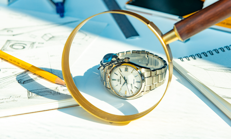
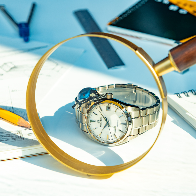
We positioned a giant magnifying glass in front of the giant Grand Seiko. One of our aims in doing this was to clearly convey the concept of the bug’s-eye view. Our another aim was to attract attention, reasoning that placing a magnifying glass there would induce people to look into it at the object behind.
An actual Grand Seiko and magnifying glass were placed next to the giant watch. The intent was to clarify the size difference and let people intuitively understand that great attention to detail is all condensed into this small product. A QR code was printed nearby, too. The linked page helped visitors learn more about our dedication to watchmaking.
The fingerprints left on the display window were proof
that people understood our intentions.
From the beginning, I felt the differences in the way of thinking between product design and space design, but as I participated in meetings with the display vendor, while receiving advice from the manager Musashi, I felt even more keenly the difficulty of taking on an unknown genre.
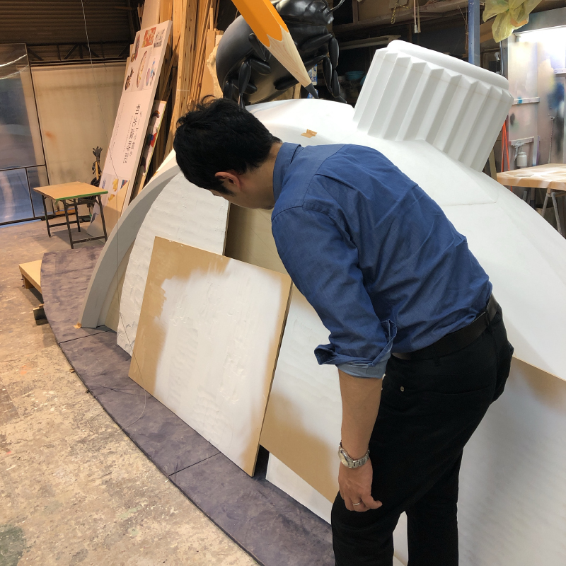
Even beginning from the question of just how much we should enlarge the watch, it was no easy task. Unlike watch design, the artwork must fit the size of the display window. If we were to try to use the whole dial, the watch itself would need to be smaller, which would lack impact.
After making some tests, we went with a watch scaled up 100 times to show the hands and indexes at maximum enlargement, and positioned so that the dial’s texture would be in direct view of window gazers. A part of a bracelet extending from the 12 o’clock position is framed within the display window, but this bracelet is quite different from one created by simply enlarging that of an actual watch.


When the bracelet part was enlarged as is, it just didn’t look real. So we exaggerated the perspective and made it fit beautifully. For me, as someone who normally designs small watches, this was an unforeseen realization.
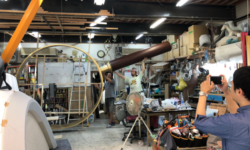
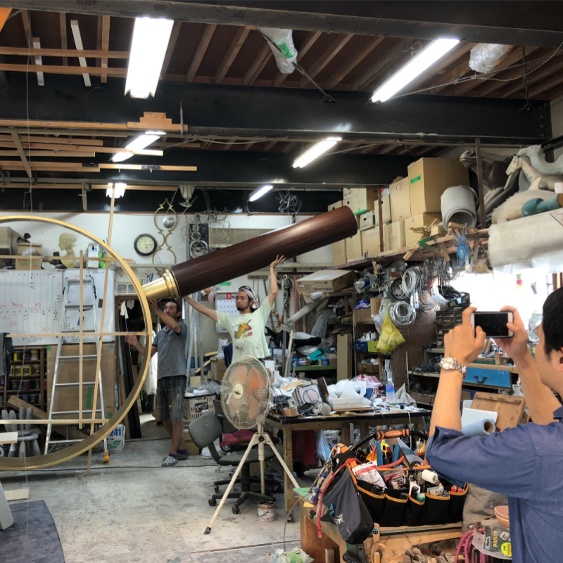
Also, Wako’s display window is curved along the corner of the intersection, so there were rigid limitations on the exhibit, and carrying the artwork into and out of the window space was tough, too. The carry-in entrance was small, so we asked the vendor to create the artwork in segments, which we assembled inside the display window and then painted over the joints. This was such an acrobatic process. We also took into account the layout of the exhibit so that it would look impressive no matter what angle it was viewed from. We carried out the installation while learning the know-how and positioning tricks that are unique to the Wako display window.
We also had to think about how much the dial was going to be tilted. If the dial were positioned at a near-vertical angle, it wouldn’t be illuminated by the overhead light, making it a bit hard to see, but tilting it too much would detract from the beauty of the exhibit. Furthermore, there is also the influence of the natural light shining down through the window. The angle of the light is different in the morning, noon, and night. Issues that I had never had to think about for watch design came up one after another.
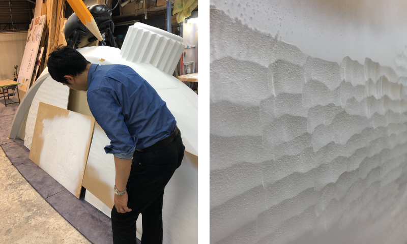
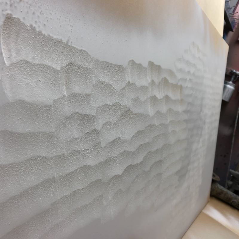
It was also hard to replicate the snow-like dial, the most distinctive feature of this model. For the actual watch, a fine grinding tool called a leutor is used to grind the surface and produce the desired texture. At first, we thought of trying to reproduce the surface texture using a contact paper.
But after all, we discovered that grinding the surface using a tool, as with an actual watch, could produce the most accurate replication of the texture. We were able to appreciate again that the unique sense of the original dial is something that could only be achieved by handwork. After a trial-and-error process for the degree of grinding, we were satisfied with the finished texture.
Although it was still design work, I felt that I was using my brain in a different way from my usual work. When I recall those days now, I still think that it was such a challenging task. But amid the difficulty, there was something that gave me a sense of accomplishment. When we looked closely at the area next to the giant watch where the actual watch was laid, we found lots of handprints and fingerprints left on the window.
When we saw those prints, we realized that people had stopped walking because they noticed the giant watch, and had then become interested in the actual watch and had peered in at it also. We were relieved to think that we were able to move the hearts of people coming and going in Ginza.
As with this project, we product designers at Seiko have recently become more and more engaged in different areas of design, with the April Fools’ Day project being a prime example. Joining such projects gives us inspiration and broadens our horizons as designers. Having come to know the difficulty and the challenges of presenting the appeal of a product to the public, and having gone through the process of examining and implementing various kinds of approaches, I feel I will be able to make use of these experiences in designing Seiko watches.
![Vol.19 [Discussion] Where is watch design heading?](https://www.seiko-design.com/wp-content/uploads/2020/01/19-top-newarrival-1.jpg)