

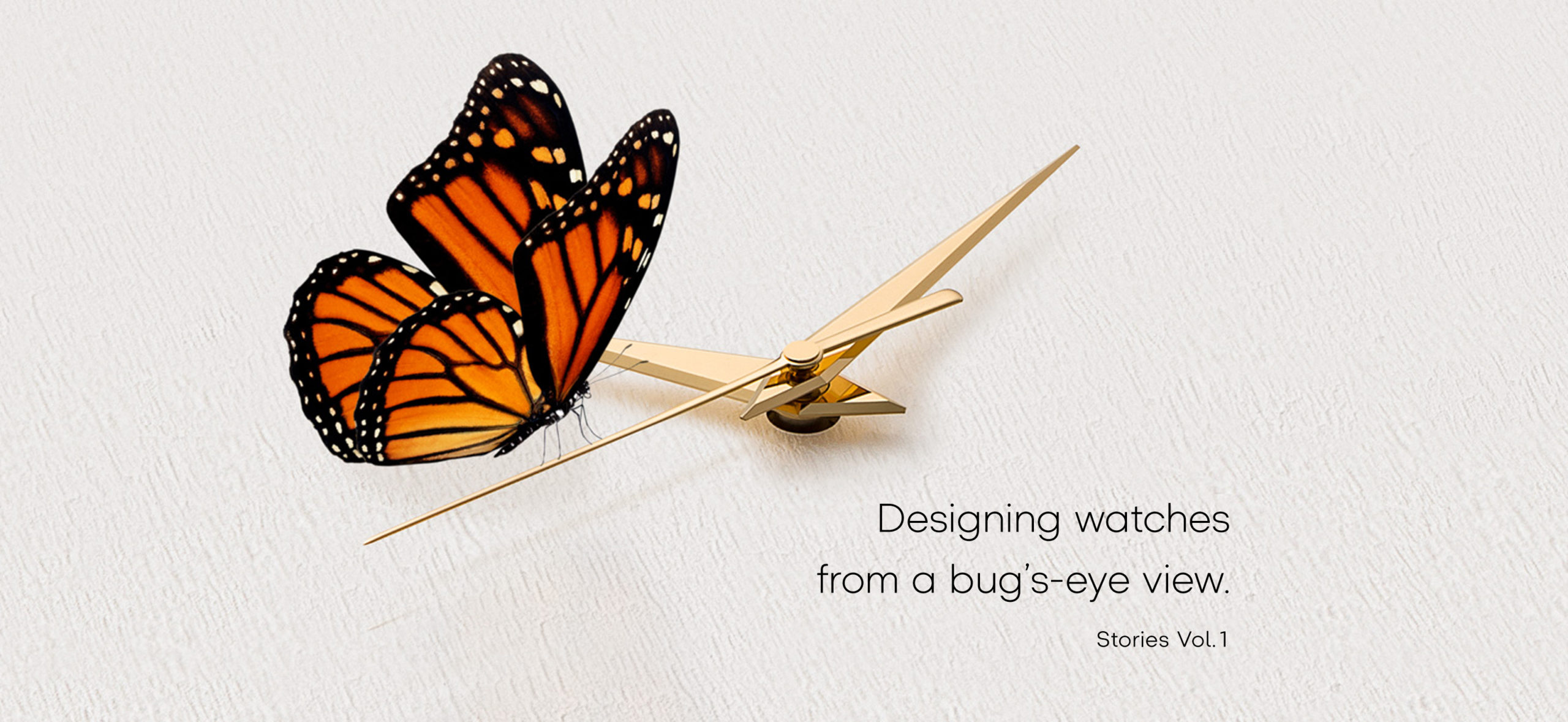

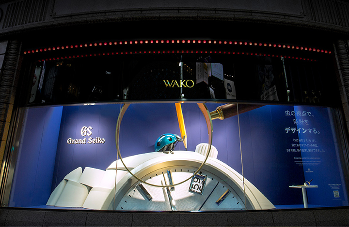
Looking at things from a bug’s perspective in order to stir human emotions.
By the same token, we also use this but’s-eye view in order to enhance legibility. For instance, the watch we have here, the Grand Seiko Chronograph SBGC203. The stopwatch sub-dial is recessed into the main dial by 0.02 mm. This is to let you really “see” the time. When you just glance at the watch the stronger presence of the sub-dials makes for easier viewing. If this, though, is sunken not 0.02 but 0.04 mm into the dial, it gets in the way when the stopwatch is not in use. Then, wondering what the most suitable size was, we made repeated trial and error attempts and came to the conclusion that 0.02 mm was the perfect size.

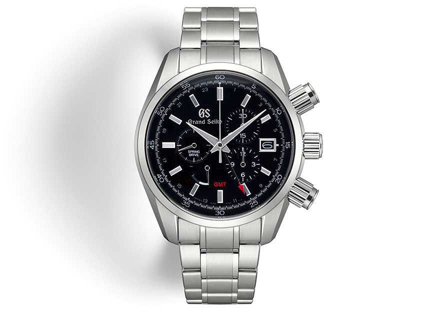
If you change the viewing angle using the left-right buttons, you can feel the slight difference of 0.02 mm between the main dial and the sub-dials. This is just one example of the “bug’s-eye view” design approach.
Speaking of details, if you enlarge the polished metallic finish you won’t find any marks whatsoever. For the Grand Seiko this kind of thoroughness is only natural.
And the Grand Seiko exquisite needle-like minute hand. I would like to say that even if viewed under a microscope, this hand appears to be acutely sharpened right to its very end. But that’s not quite right. The thickness of the hand is roughly 0.2 mm and it has been bent around vertically to cleanly align with the dial. Rather than sharpening the hand right to the very end, this approach makes it easier to distinguish between the minute hand and the minute markers. When viewed from a distance it is just a watch hand in a bamboo shape but actually it’s surprisingly multi-faceted and three-dimensional. I can’t get into the really minute details, but the angle between this surface and other surfaces it comes into contact with has been calculated with the utmost care.
If you enlarge the photo, you can see that even the hour hands have been crafted with the utmost attention to detail in order to enhance legibility
Can we successfully achieve the perfectly ordinary? Our real aim is to surpass the ordinary and achieve superlative legibility. We create our watches with the utmost attention to detail to ensure a design that will touch the very heart strings of the user. This, perhaps, is what design is really all about.
If we discuss this in terms of the watch I mentioned earlier with the snow texture on the watch face, the process of adding texture by using a leuter might well be referred to as “damaging” the watch. There are times when “damaging” the watch is actually part of the design. This is a rather interesting way of looking at, don’t you think?
In order to ensure the comfort of those who often look at their watches, and in order to provide a little excitement, we create details. The example presented here is only one mere example. Every aspect of the design has a legitimate reason, including our designers’ “bug’s-eye view” and the multitude of design preferences it encompasses. That’s just the way it is in the world of design.


![Vol.19 [Discussion] Where is watch design heading?](https://www.seiko-design.com/wp-content/uploads/2020/01/19-top-newarrival-1.jpg)