“Mature elegance.” Is it being playfully imaginative?
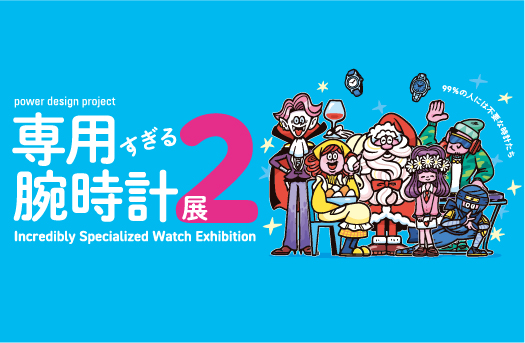
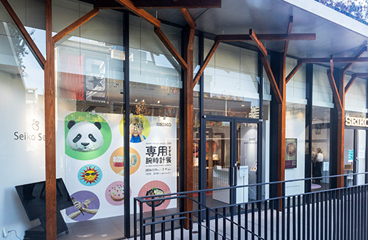
I would like to talk about the Power Design Project, which was initiated in answer to the question “How should Seiko watch designers move forward into the future?”
Looking back on this activity, I realize that this project commenced close to when I first joined the company and had a strong influence on my unique individuality as a designer and the products I created thereafter.
The Power Design Project did not get its start as an exhibition, but more as an in-company study group. For instance, there were various workshops attempting to do such things as “analyze the relationship between people and their watches in the course of their daily lives by observing where people keep their watches after taking them off.”
As an extension of this, in 2002 we started to make prototypes and make them available outside the company. The first workshop I attended was the second project in 2003. I, having only been with the company for 6 years, was the youngest of the participating members. The theme we were given was “mature elegance.” All members felt that something playfully imaginative that elicits a slight chuckle is real “mature elegance,” and with this in mind I presented two designs.
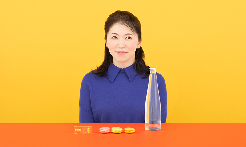
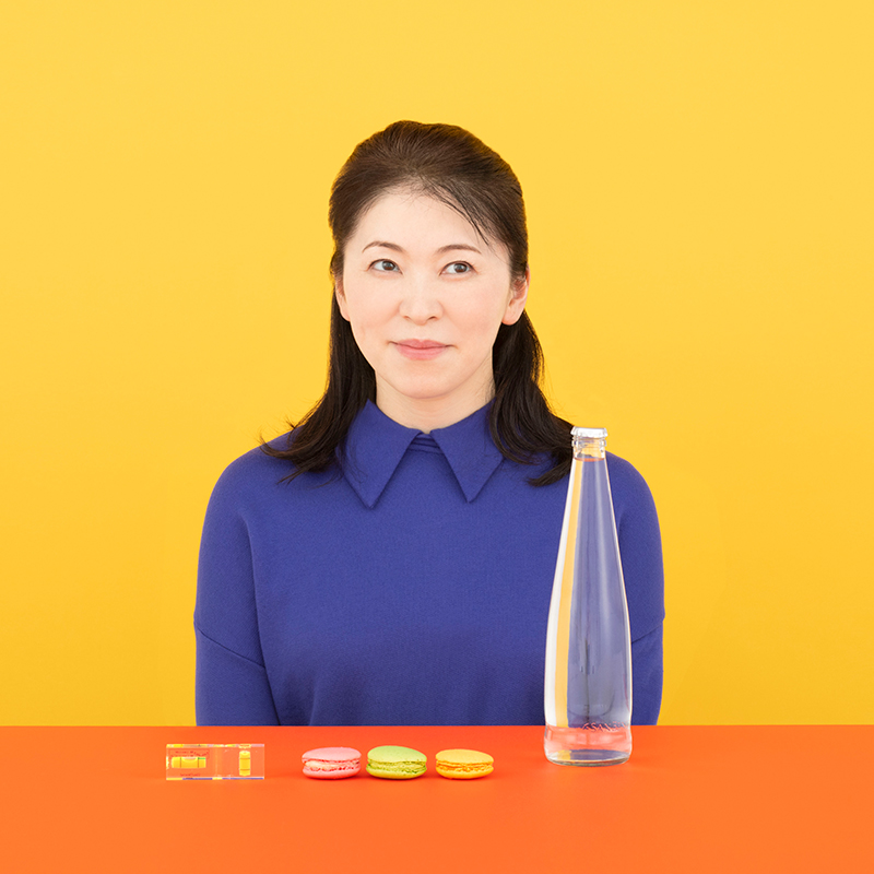
What happens when you turn a spirit level and a glass bottle into a watch?
One of my design suggestions was a work called the Spirit Level. As the name suggests, for my motif I used a spirit level, a device used at construction sites or photography shooting locations to confirm that something is level. Almost everyone looks at their watch from the easiest angle without really thinking. I wanted to turn this unconscious act into a conscious one as “a new way to get closer to your watch.”
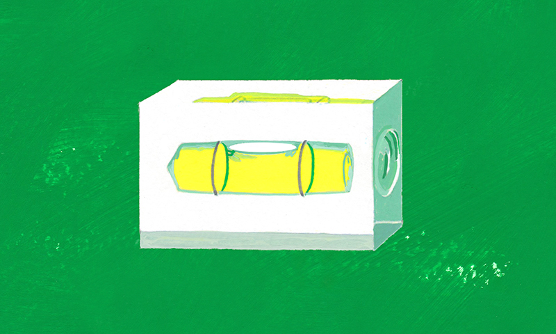
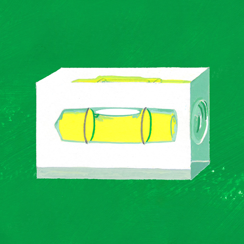
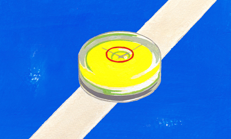
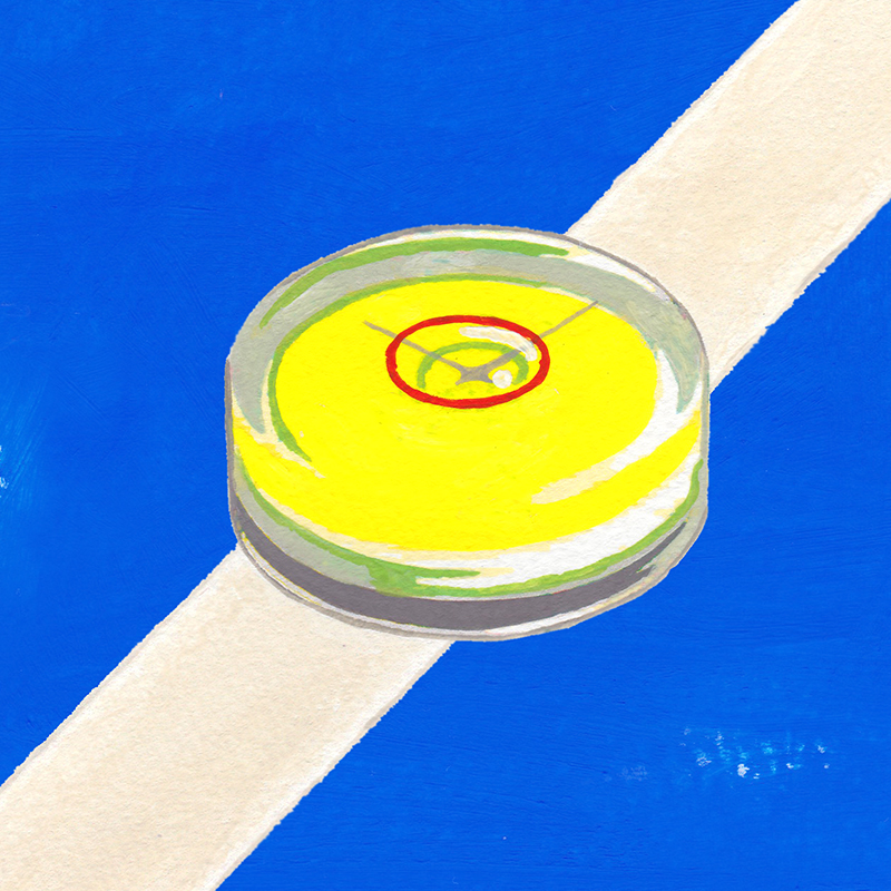
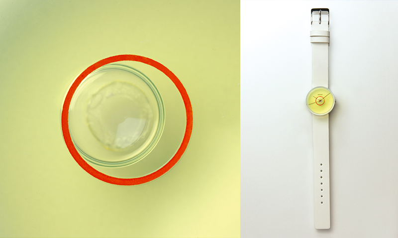
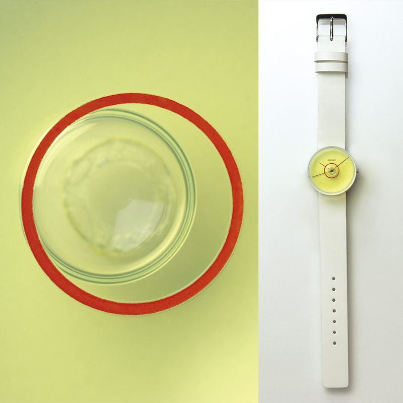
This Spirit Level was simple in design, and at that time I believed it was important to pursue “realness” in the details. Actually, this prototype was completed with help from a real spirit level manufacturer. You may think this was perhaps going too far, but to me this kind of commitment was extremely important.
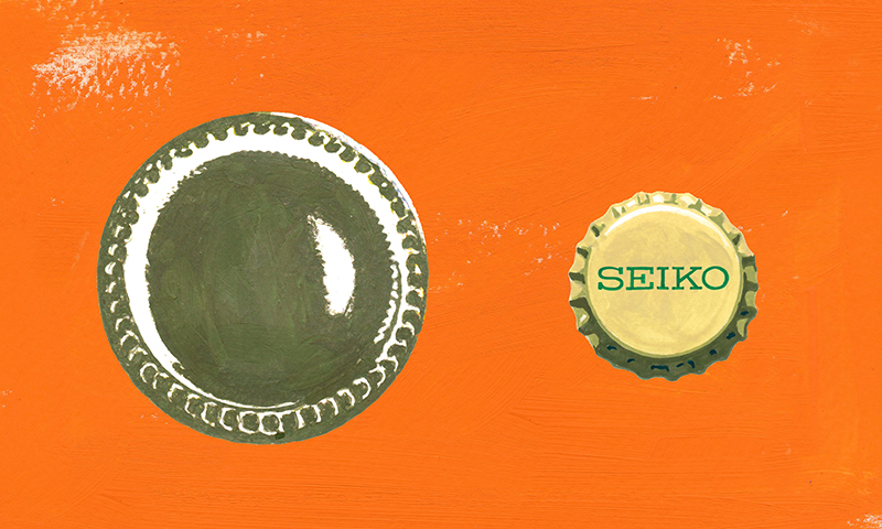
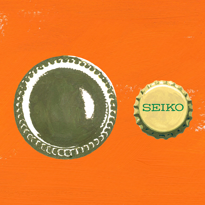
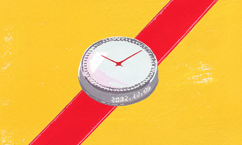
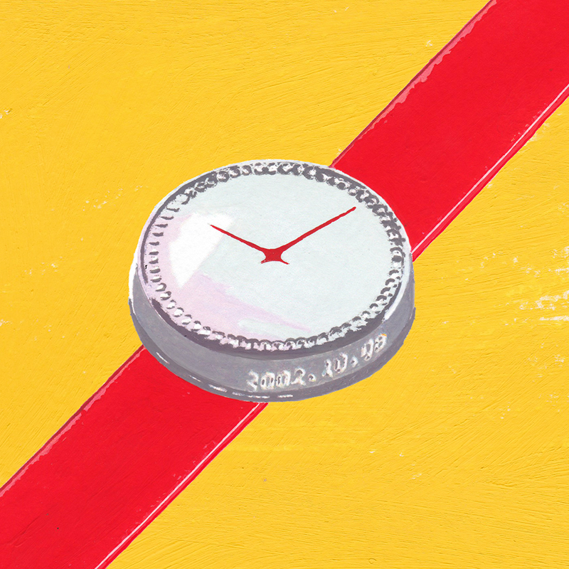
The other item is what’s called the Bottle. This is the prototype with the clear glass bottle motif. I made this with the idea of cutting out the middle part of a bottle and then connecting just the bottle cap and bottom of the bottle. When you look at the glass surface, it has been designed to appear curved like the bottom of a bottle, and when you turn over the watch, the case back is shaped like a crown cork.
Looking at a glass bottle, I came up with the notions that “the bumps on the bottle bottom are like markers on a watch,” and “the crown cork is like a screw-on case back.” The side of the main body of the watch was similar to the side of a glass bottle where the expiration date is engraved so I playfully added the embossed date of the exhibition.
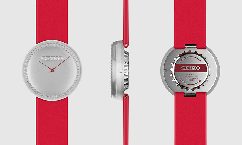
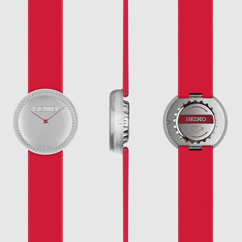
That idea was revived as a mass-like watch.
These were no more than prototypes, and not designed with the intention of being sold commercially, but several years later, while continuing with the idea of the Bottle shape, a model was actually commercialized in 2007 as part of the Seiko Moving Design Collection.
Because the Power Design Project activities included trial and error attempts and prototypes, I think we can say this design actually made it out into the world. Figuratively speaking this was also true, and perhaps if there had been no project like the Power Design Project to challenge our design capabilities, there would not have been the necessary internal understanding and cooperation to make this happen, and there would not have been the opportunity to market this Moving Design, the somewhat specialized collection for the Seiko brand.
When the Moving Design was being planned I became strongly aware that I really wanted to produce a mass-like watch. To be more specific, I wanted to produce something in which the case and the dial appeared to be integrated.
Wondering how I could go about accomplishing this, I came up with an integrated case and dial, with a gently rounded earthenware mortar shaped dial similar to the Bottle. In addition, long and thin hands of maximum length which would produce shadows on the dial emphasize the earthenware mortar shape.
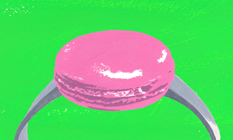
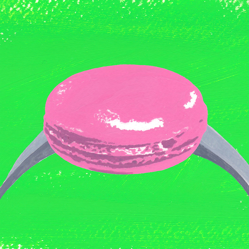
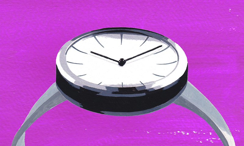
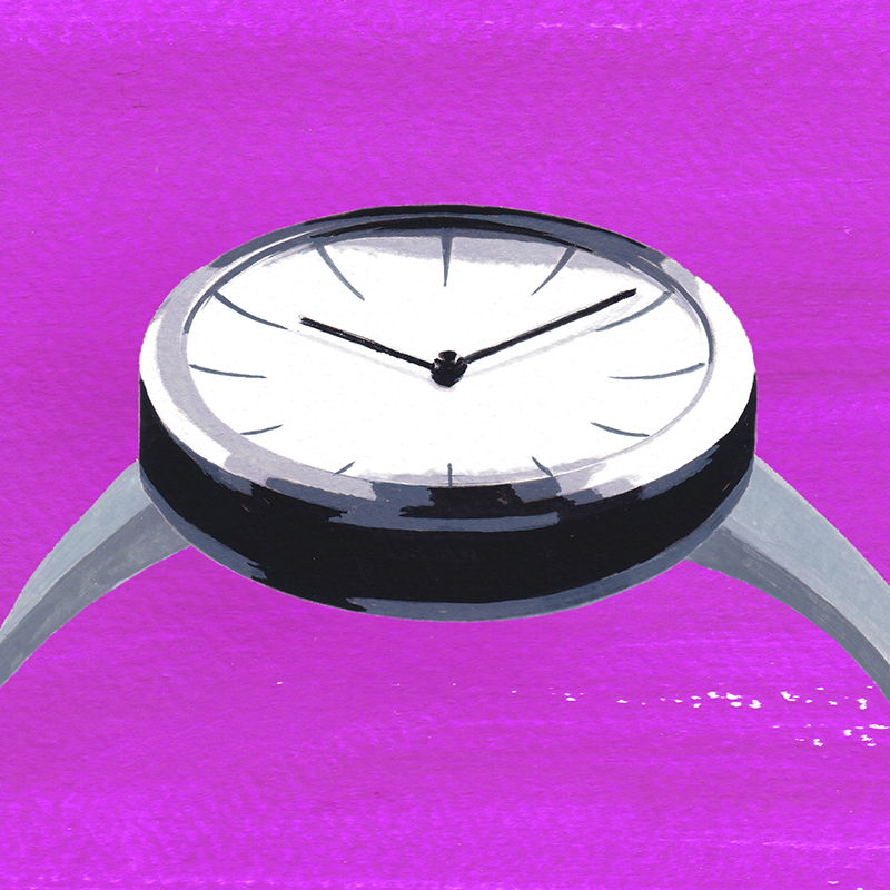
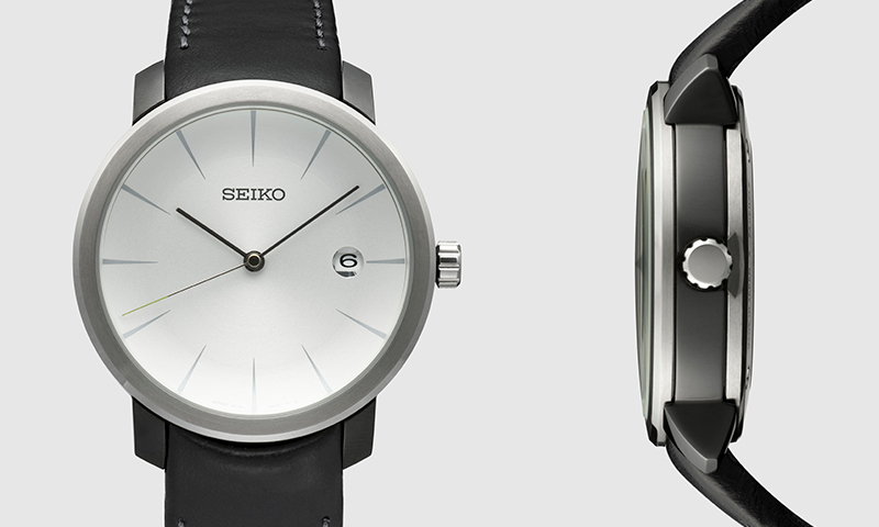
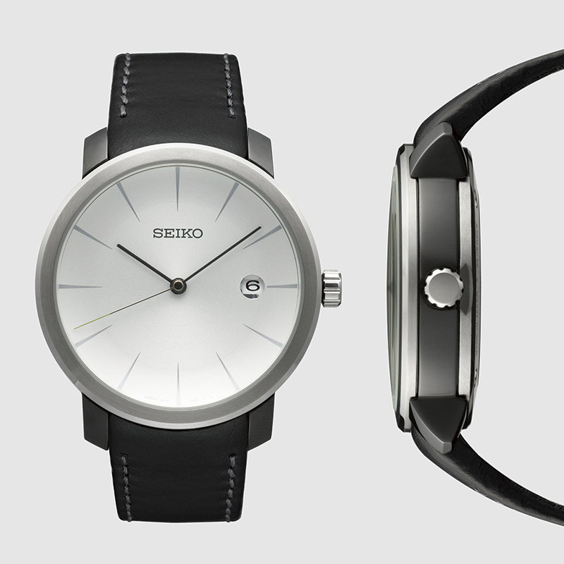
When working on the Bottle design, I gave the dial an earthenware mortar shape to make the watch case, which was smaller than an actual bottle, appear more bottle-like and curved. But for the Moving Design work, I was aiming at an integrated feel between the case and the dial and also went with the earthenware mortar design. The objectives in each case were different but as a means of bringing ideas to life, both of these designs seemed to me to be somehow interconnected.
The image I had in mind at this time was not a glass bottle, but a dish. The upper surface of the dial is not flat; the very center is an earthenware mortar shape like a dish. For giving the upper and lower parts of the case an integrated feel, the macaron shape came to mind. In a good sense, the design is distinctive because it is deliberately trying to avoid being overly watch-like.
The Seiko Moving Design Collection was awarded the Good Design Award in 2008 and received public recognition even while undergoing various ups and downs. This fact is the result of the significance of the Power Design Project.
In all honesty, looking back at the Bottle and the Spirit Level, there are many parts that make me feel that I was so young back then. Maybe it was because I was still not used to the business but compared to the prototypes of other veteran participants, I feel mine were lacking a watch-like aura. On the other hand, this might just have been an expression of my youth and a desire to come up with ideas that would let me break away from conventional constraints.
I participated in this project twice, in 2003 and 2008, but over time it has really been the freely conceived concepts, not those restricted to being watch-like or Seiko-like. That has empowered me to move forward and realize my own self-determined design potential and individuality.
