What is the design that can provide the proper “light and shadow correlation” in a watch?
“Light and shadow” is, of course, not merely a matter of simple “brightness and darkness.” It is open to a wide range of interpretations, it has a very close correlation to watch design, and it is absolutely indispensable. Let me take this opportunity to explain this in more detail.
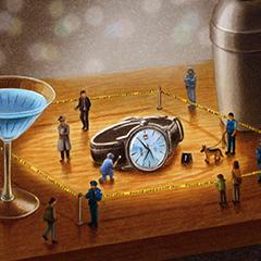
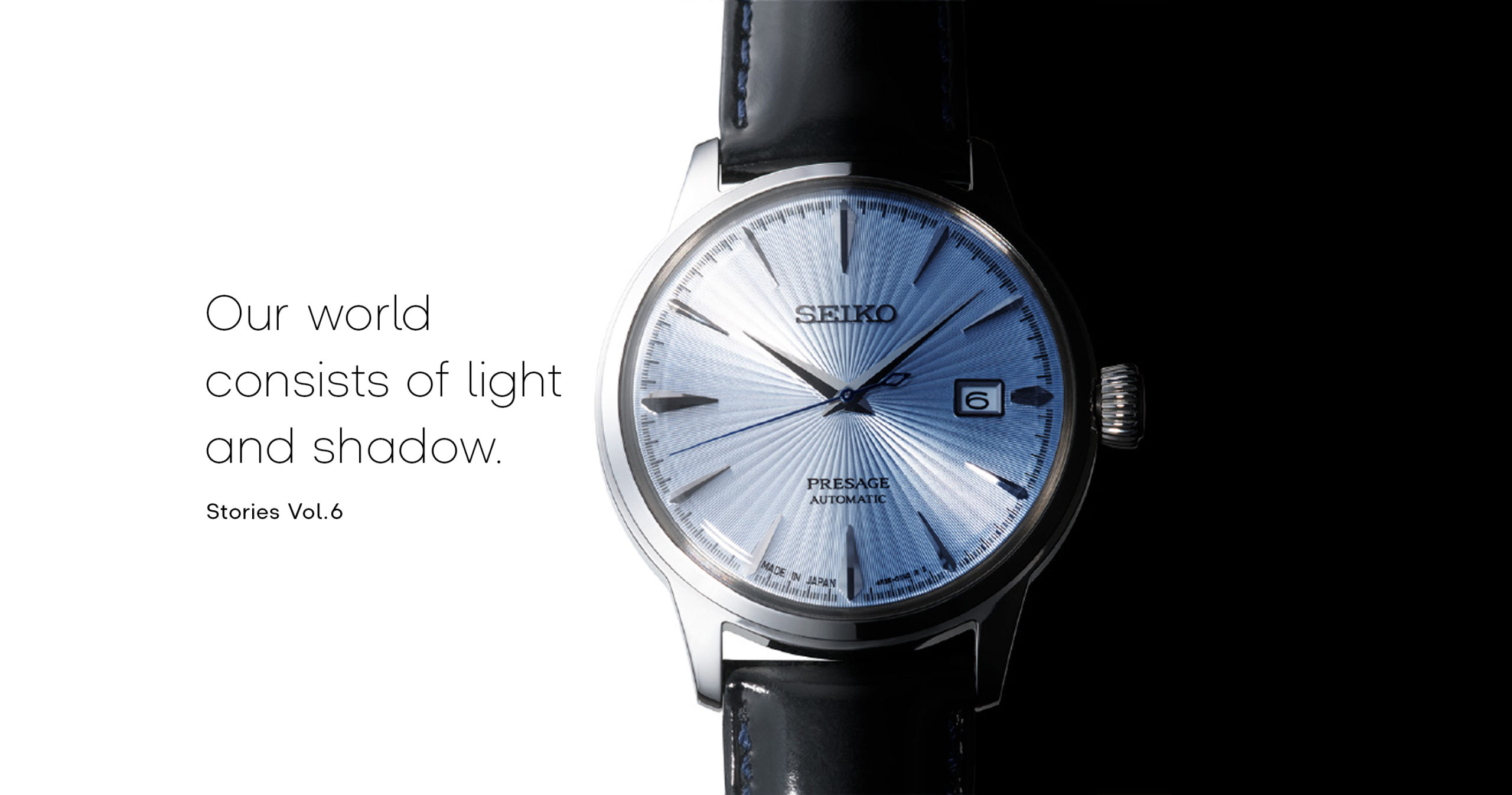
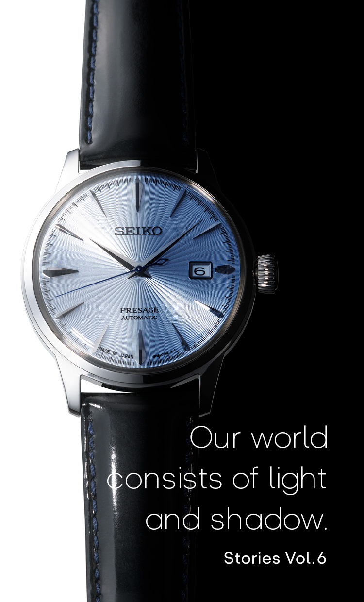
First of all, let me introduce this watch here. This is one watch from the Presage collection which was inspired by the glamor of the cocktail bar. This resplendent, slightly glamorous design motif is literally a glass into which a cocktail is poured. It is one of our most popular models.
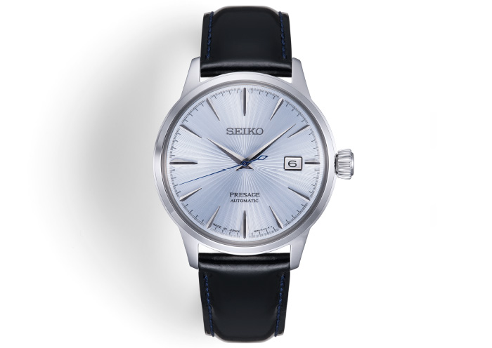
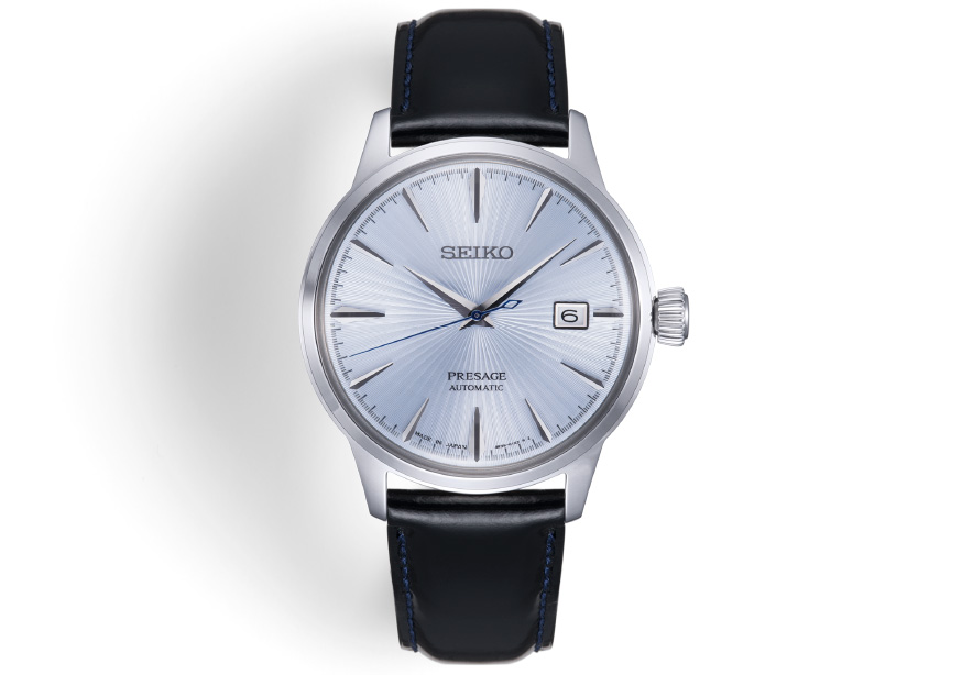
This color and sparkle, precisely like a cocktail being poured into a glass, have been incorporated into a design which exudes a nighttime mood. The distinctive index shapes replicate the long axis of the glass “stem” into which the cocktail is being poured.
By far the most distinctive feature of this watch dial is the three-dimensional visual effect comes from the polished top coating and the delicate intagliated pattern on the dial base. Depending on the light source and the viewing angle, an entirely different light and shadow correlation is created, enabling the dial to show a variety of expressions. Just like a real cocktail, the watch mesmerizes us with its beautiful glittering light.
So you can say that the design of this collection is a good example of how “light and shadow” can be used to maximum effect.


An “Instagrammable” watch.
It goes without saying that this cocktail-based collection has been very popular from a sales perspective, with many people posting photos and video, and even occasionally specially customized photos with their favorite bracelets on SNS such as Instagram, to share with users around the world. The dial is bright and emits light and this light can change with the surrounding scenery or with the time, presenting an enchanting sight, which is probably all the more reason why it is called an “Instagrammable” watch.
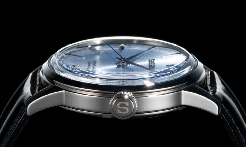
If you look very closely, you might see the dial seem to expand and take on a more three-dimensional appearance. But, in fact, it is completely flat. It appears this way because the glass that covers the dial has a very round shape. By making the glass round like this, the light is taken from various directions causing the dial to brighten and take on a liquid-like three-dimensional appearance. Describing this phenomenon with a term originally used to describe food products, the dial is said to have “sizzle,” and this is what makes it so popular for posting on Instagram. As we are all aware, there are lots of people who post photos on Instagram of delicious looking lunches and dinners.
Of course, this watch collection pays extra attention to the colors used in its designs. Among them, the light ice blue color dial was particularly difficult for the manufacturing department to get just right color. Pale colors, as opposed to deep colors, tend to make imbalance of color brightness show up more noticeably. This is perhaps similar to a real cocktail in which a fine harmony between the liquor and the fruit juice is essential.