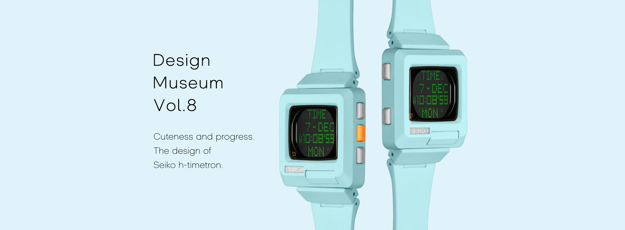
Targeting young people, What kind of new designs do we create?
The product development began in 1998. The project kicked off with the aim to develop a new brand targeting young people. At that time, the world was full of watches targeted at young people, including Seiko’s own watches. “Nevertheless,” recounts Tsunami Hiramatsu, one of the designers on the team, “we felt that it was still possible to create new designs, and there was a demand for a product with a high sense of new proposal. And what we determined early on was to target young people who have aspirations of becoming creators.”
What kind of design can evoke
the Seiko image, while also being
something completely new
to the Seiko brand?
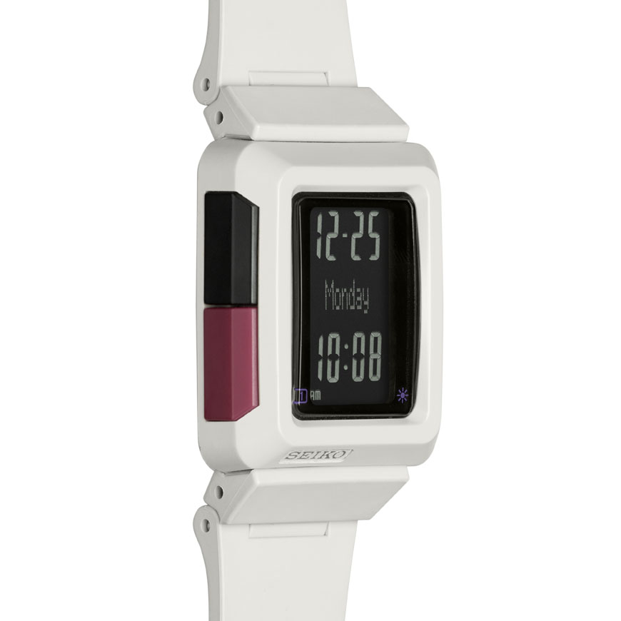
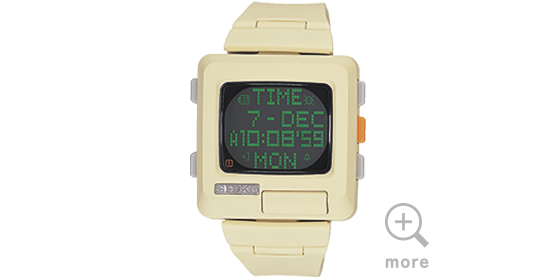
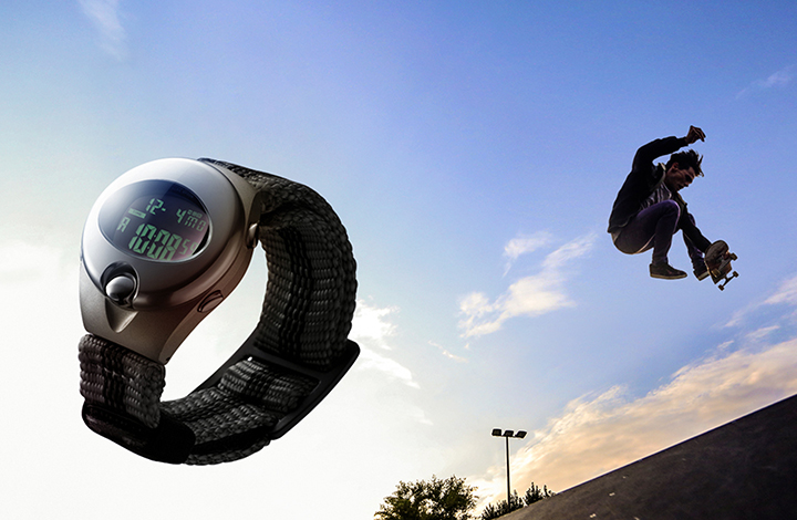
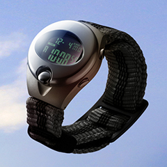
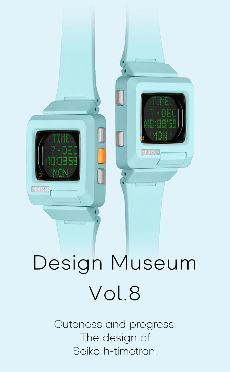
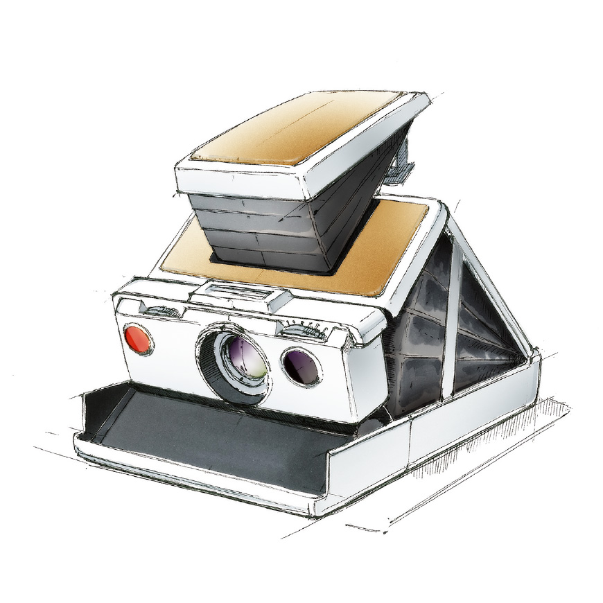
The product development started from the uncertain situation where the team members didn’t even know whether the watch was going to be analog or digital. The idea that they first decided on as a team was to make a watch that soothes people’s hearts, which was something rare for watches of that time. If this idea were restated in today’s terms, it would be a Yurui, or relaxed design. Nevertheless, they also considered that it was still necessary to show Seiko’s sense of technology and progress within the design. Then the team hit upon the concept of a design that has both technology and cuteness, like an instant camera.
From a moment of nostalgia
for an old PC, the design work
takes off in one direction.
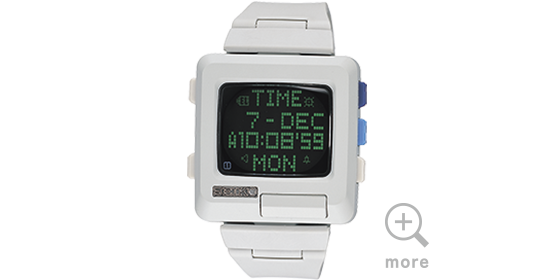
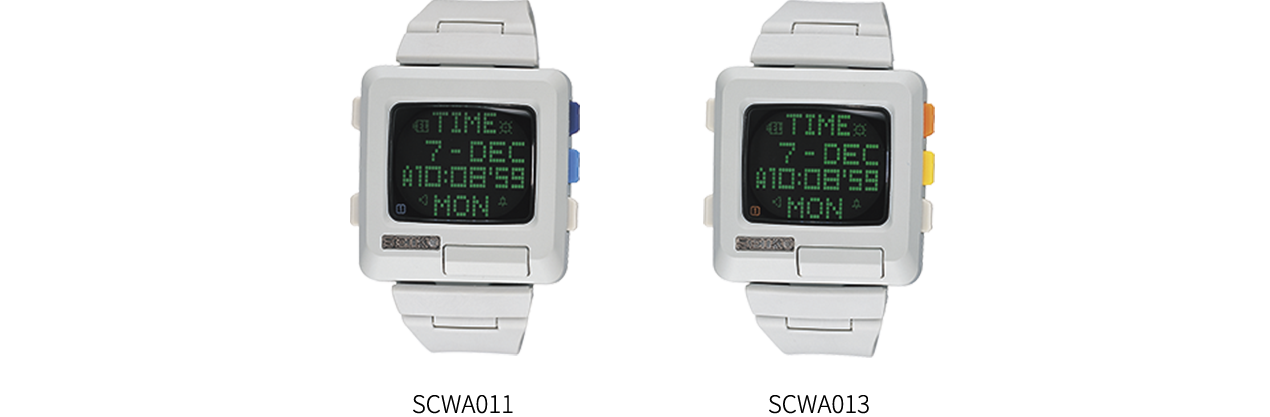
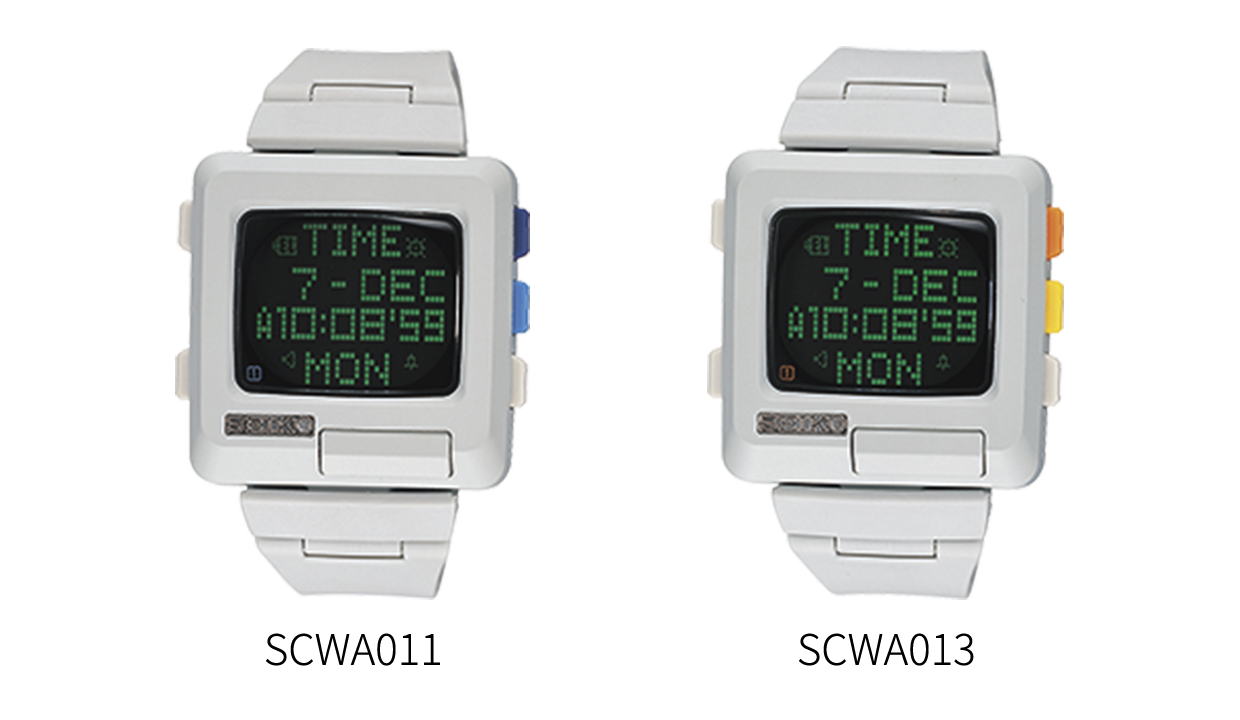
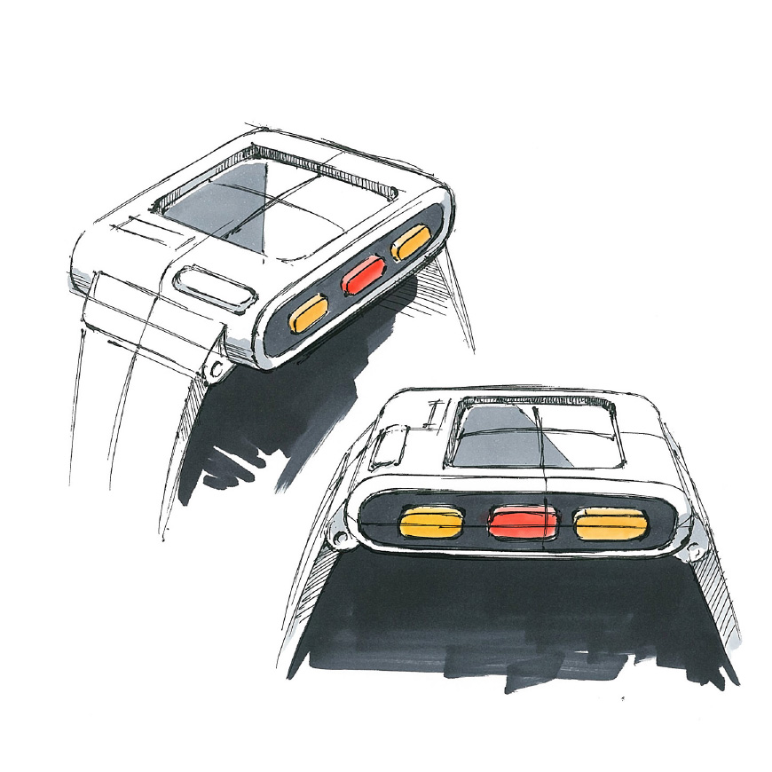
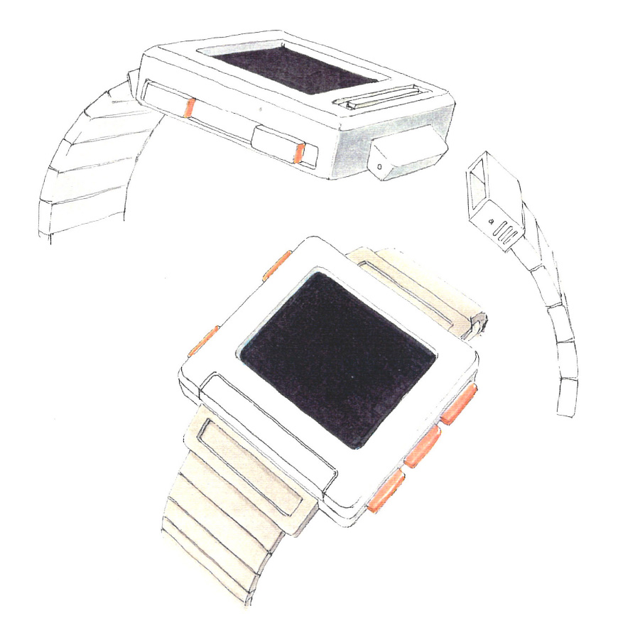
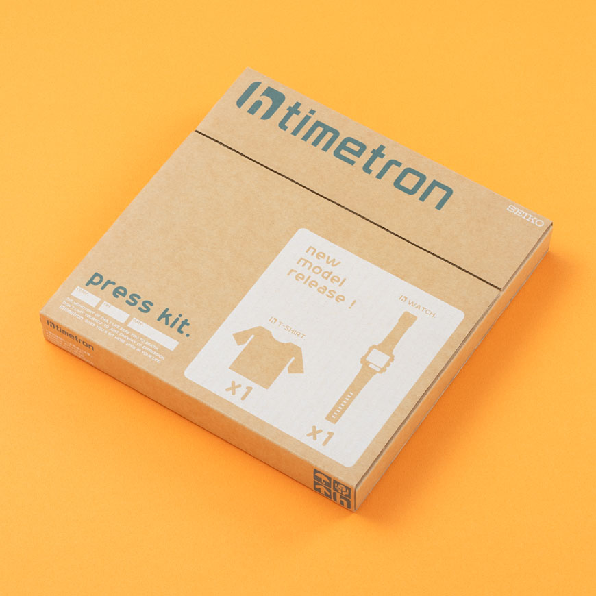
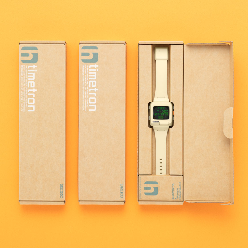
The design team drew sketches and verified calibers and other elements. One day, when Hiramatsu was looking at a dot-matrix caliber, the image of an old PC from his childhood days in the 80’s came to his mind. Setting that sense of nostalgia as the image goal, he and the team got to work on the design. The team pushed forward with work on the project, including the naming of “h-timetron”, the logo, packaging, goods, and promotion. It eventually became a project that involved not only the planning and design but also various activities that everyone wanted to do from beginning to end.
Embodying the dream of a prosperous future, the design brings a feeling of happiness to those who look at it.
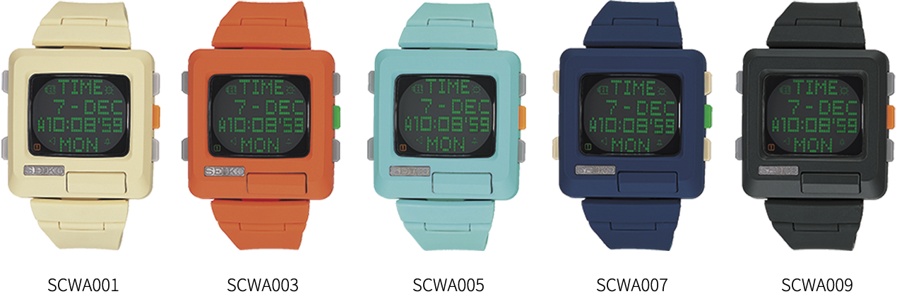
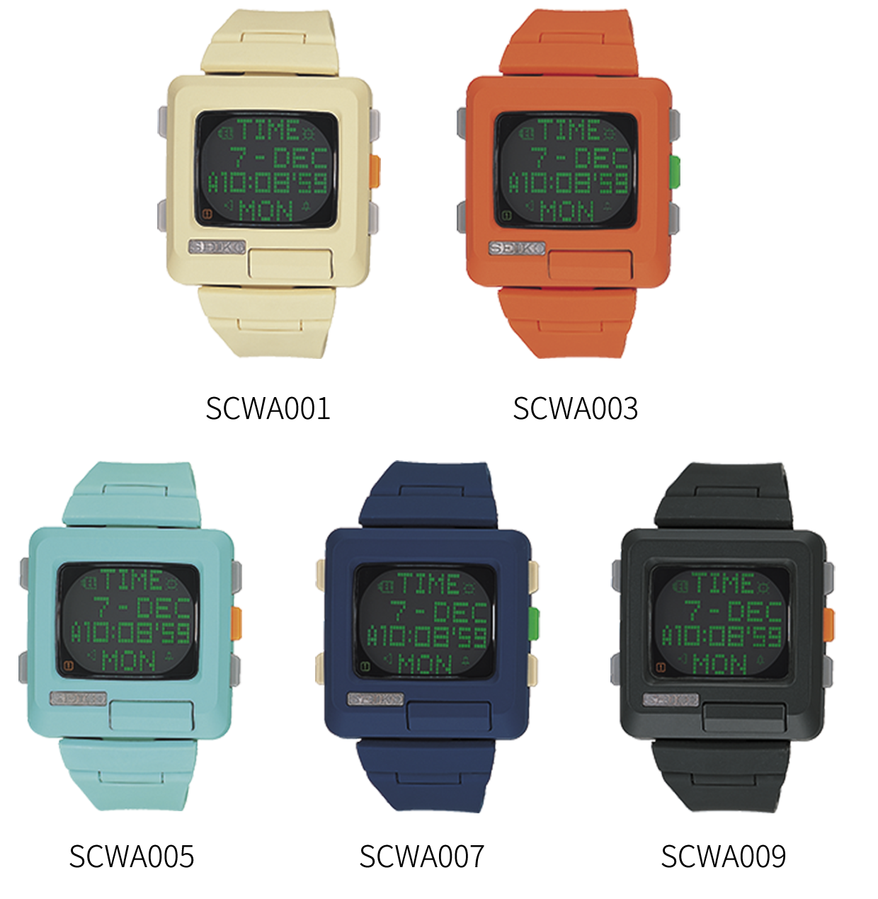
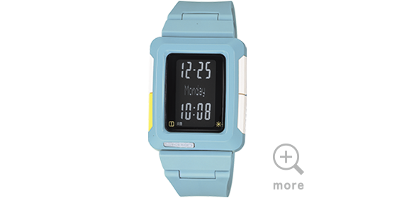
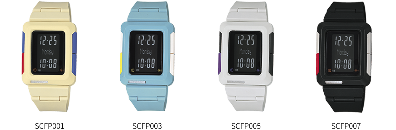
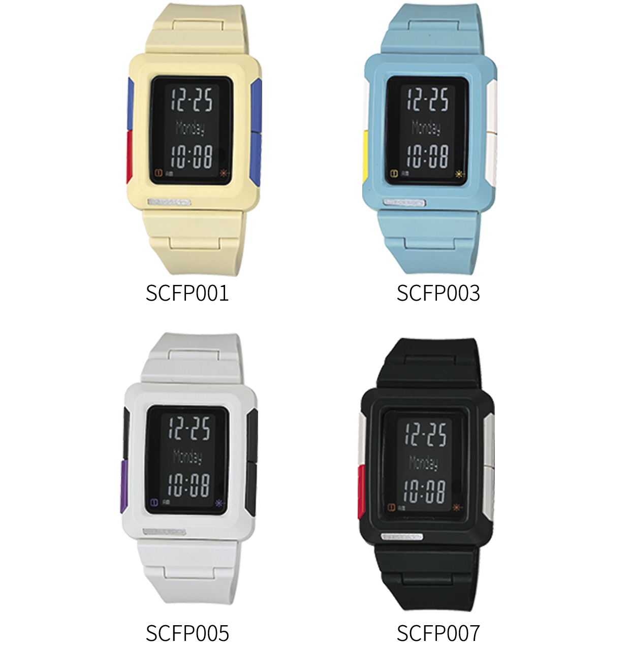
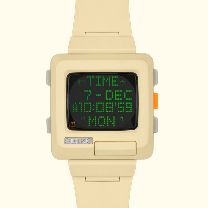
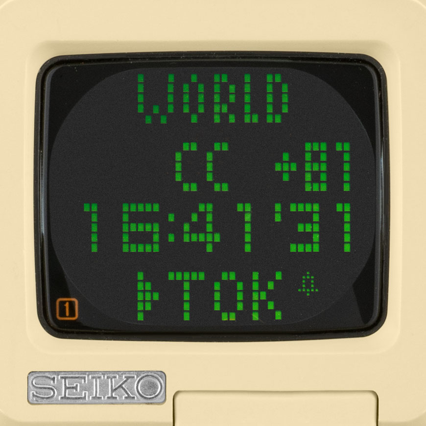
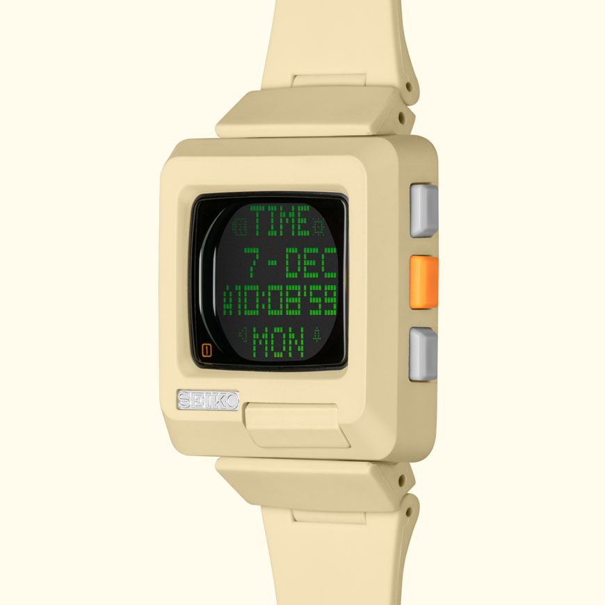
What this product indicates is a prosperous future through technology. To achieve this, dedicated attention was paid to the details, including the green characters on the liquid crystal display and the look of the fillet (rounded) corners. Additionally, the color variations such as ivory, reminiscent of the body of a PC, gave these watches a distinct personality. The h-timetron enjoyed such popularity that a second model was launched the following year. The second model’s theme was space travel, with thoughts on the 21st century and the expectation that space would become even closer to us. About 20 years have passed since the launch of the h-timetron series. The product still exudes a general sense of hope for the future of humanity.