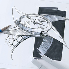
Deciding the “face” of the new Seiko 5 Sports.
Matsue: The new Seiko 5 Sports was rebranded in September 2019. This project was moved forward mainly by young associates from several divisions such as product planning, advertising and sales promotion, and manufacturing. Today the members from the design team will talk about this project from their various perspectives.
From the beginning, this project already had a plan to market the products to the millennials (people in their early 20s to late 30s), so for the rebranding, we set to work on finding a direction of design that would befit the face of the new Seiko 5 Sports.
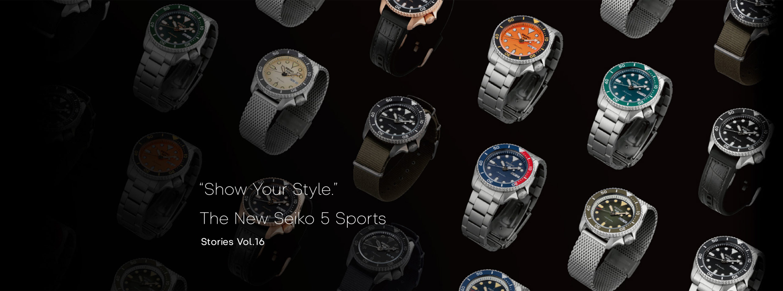
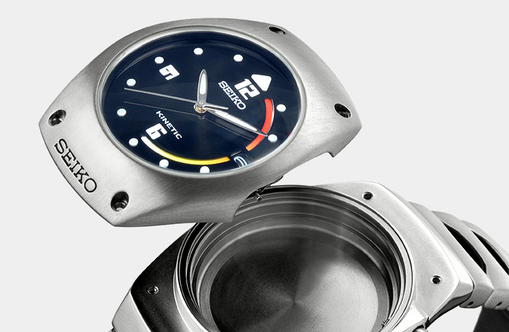
The team members suggested many ideas from the Seiko archives and other sources. Among those ideas, the most popular proposal was the Seiko diver’s watch SKX series (hereinafter SKX), which is nicknamed BOY by its fans and is highly popular around the world. We thought while inheriting the design of this series, which has a long history and has an aura all its own, we wanted to develop it by adding some modern values to make the brand meet young people’s needs. What we aimed for was “a mechanical watch that shows the wearer’s individual style.”
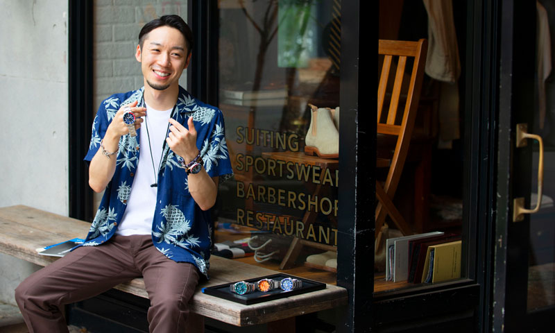
Matsue joined Seiko in 2013 and has mainly been involved in Seiko brand projects targeted toward young people, with a focus on the Japanese and Asian markets. Today he designs watches for the international market, predominantly the Seiko 5 Sports.
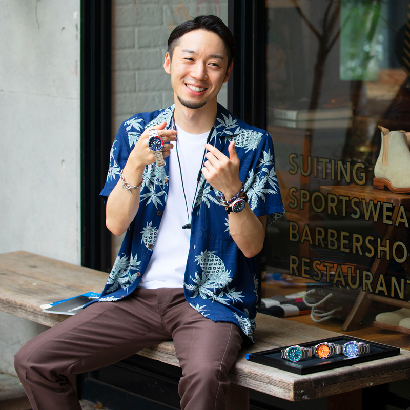
Matsue joined Seiko in 2013 and has mainly been involved in Seiko brand projects targeted toward young people, with a focus on the Japanese and Asian markets. Today he designs watches for the international market, predominantly the Seiko 5 Sports.
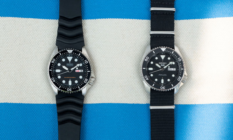
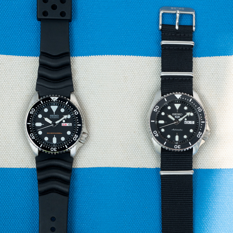
In order to materialize the concept, we held various discussions across divisions on what to maintain and what to renew pertaining to the features of the SKX. Amidst these discussions, the biggest decision was reviewing the premise of the diver’s watch specifications, which were the most prominent features of the SKX, the origin of the new model.
Breaking free from restrictions creates new personality.
Matsue: There are stringent company standards for a diver’s watch here at Seiko. A watch must pass an enormous number of inspection criteria, such as waterproof performance, shock resistance, and legibility in dark places, to be called a diver’s watch. After many discussions, we decided to remove such restrictions from the new model’s specifications.
While maintaining the intrepid designs derived from diver’s watches, the new model is not required to withstand diving in the ocean. While using distinctive designs that have matured through the development of diver’s watches, the new watch “continues to change in accordance with various styles of today.” With these keywords as a common language, the project members shared their mindsets.
Most of the Seiko diver’s watches have a graduation on the rotating bezel dividing its circumference into 60 parts. This is for a time-preselecting device, to measure the time using the numbers marked on the rotating bezel. This graduation is essential for a diver’s safety during diving.
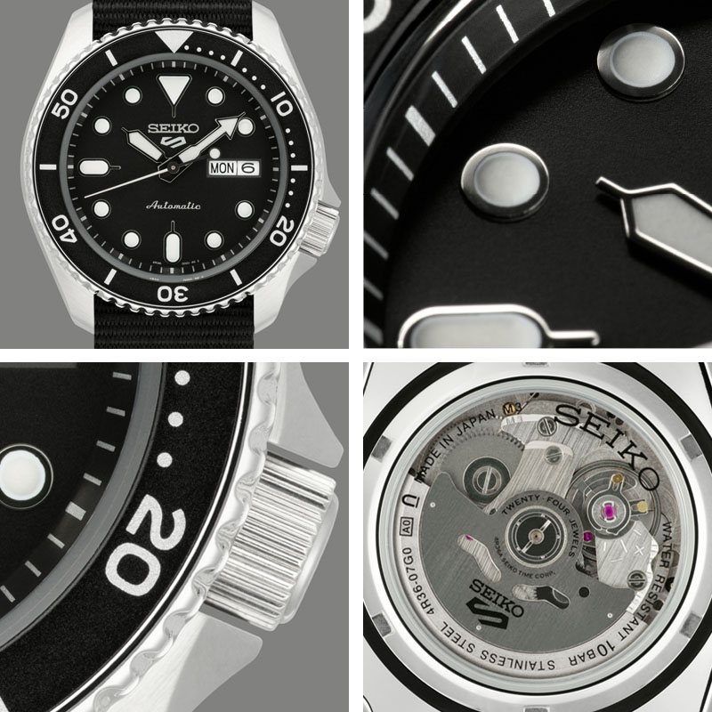
However, when looking at the new Seiko 5 Sports, the graduation is purposely marked only up to the 20 position to express lightness around the bezel for design’s sake. In the process of designing, we had discussions not only on up to which position we should mark the graduation, but also on whether or not the shape of the graduation marks should be changed.
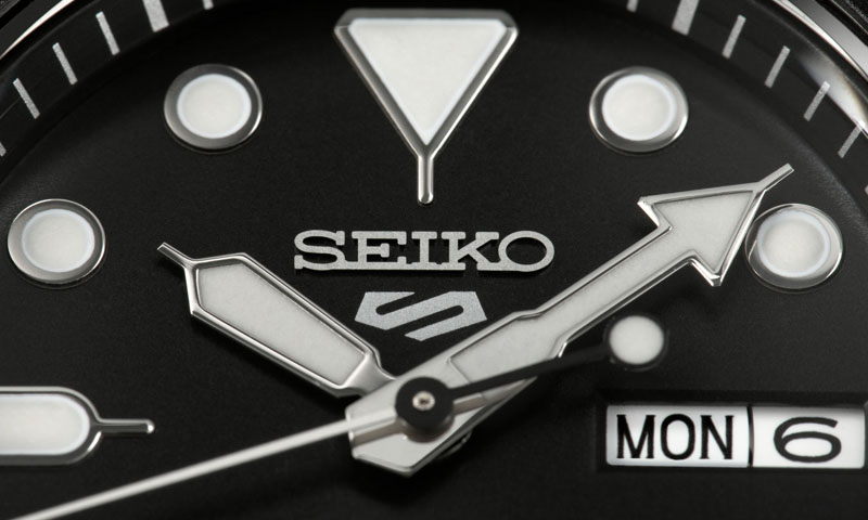
Actually, the indexes on the dial have been changed, too. The indexes of the original diver’s watch were printed, but this time we updated the design using embossing to give it a three-dimensional feel and a sense of depth. The watch contains the upgraded version of the movement used in the SKX, with steps taken to also update functionality.
Matsue: During finalization of the framework of the new model, we suggested five styles —Sports, Suits, Specialist, Sense, and Street— as an index for expressing various styles, and came up with the idea of making design derivations for each style. Around this time, several young designers joined the project and broadened the range of ideas. Goda-san is one of the members who participated in this project back then. How did you feel about it?
Goda: It was the first time for me to proceed with work in this way, so I felt somewhat confused. When thinking up ideas, I always kept in mind the diversity of sporting situations and the various designs that can meet those needs. For example, with people going to outdoor festivals in mind, I thought of a watch that can be worn to suit the feeling of going outdoors.

Goda joined Seiko in 2017. For the Seiko brand, she designs watches for Europe, America, Asia, and other international markets and Japanese ladies’ watches.

Goda joined Seiko in 2017. For the Seiko brand, she designs watches for Europe, America, Asia, and other international markets and Japanese ladies’ watches.


Matsue: I think that being freed from the restrictions of diver’s watches, the level of freedom for proposals and the breadth of interpretation were expanded.
Goda: That’s right. There was some degree of freedom, but at the same time, there were also many challenges. We’re sure that analog mechanical watches will touch the hearts of young people in the same generation as ourselves, but there are still many people who have never yet actually held a mechanical watch in their hands. I wondered how I could express the appeal of these watches in a way that young people would understand. For example, I thought “What about describing the watch using the term acoustic?” I also tried to write something like a poem to organize my own thoughts.
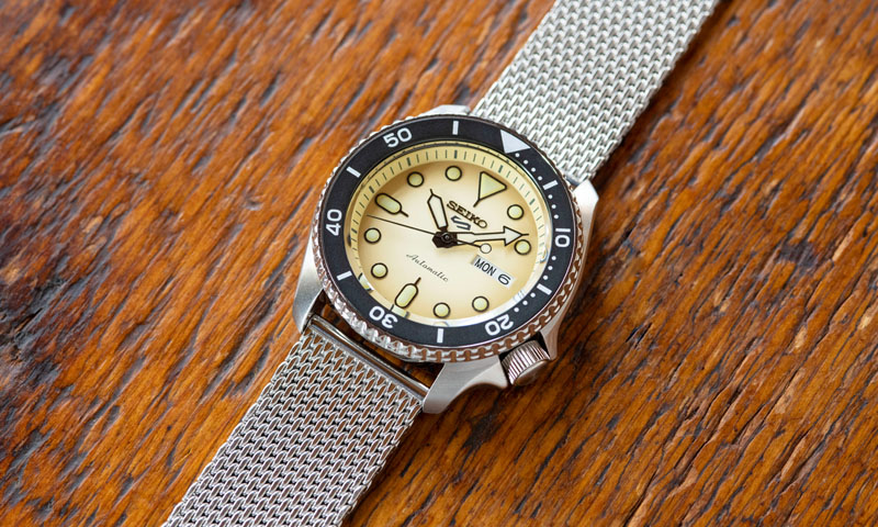
Matsue: This watch, the SRPD67K1 in the Suits style, especially gives a classic impression among the new Seiko 5 Sports models. As we researched the tastes of millennials for this project, we learned that more millennials than I expected actually favor timeless items that reflect the tastes of the 80’s and 90’s.
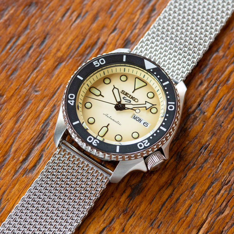


Goda: As you said, I feel that more young people appreciate a vintage feel and something with history. I myself am charmed by items with those kinds of characteristics.
Matsue: If you look very closely, the dial color gradually becomes darker toward the outside, as if it’s tanned. The combination of this gradation and the cream-colored LumiBrite produces an even more classical feel.
Goda: Including the mesh bracelet, this watch seems so nostalgic, but it is new. It’s such a design.
What kind of watches suit nature and plant lovers?
Matsue: Ito-san, what was it like for you participating in this project?
Ito: The same as Goda-san, I proposed various ideas while trying to figure things out. The idea that finally took shape became the Sense style models (SRPD77K1 and SRPD85K1). I came up with a design imagining a lifestyle surrounded by nature and plants. I thought that people who wear mechanical watches and people who enjoy growing plants have similar personalities, so I wanted to create a watch for which they would feel affinity.

Ito has experience designing home appliances, furniture, miscellaneous goods, information devices, etc. at a product design firm and an information device manufacturer. In 2018 he joined Seiko and now designs watches for the Japanese market.
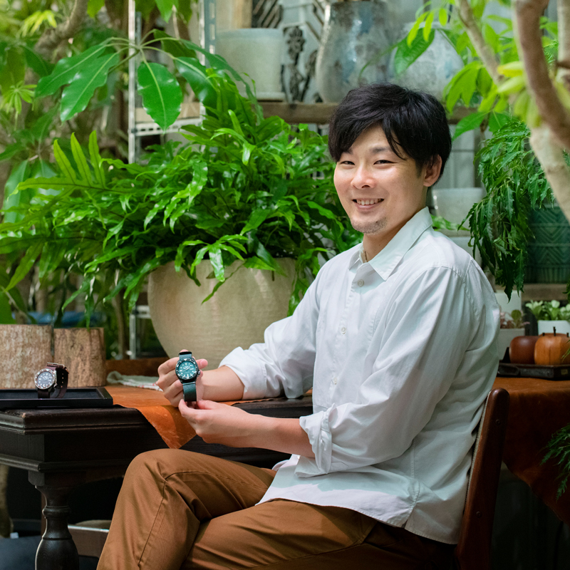
Ito has experience designing home appliances, furniture, miscellaneous goods, information devices, etc. at a product design firm and an information device manufacturer. In 2018 he joined Seiko and now designs watches for the Japanese market.
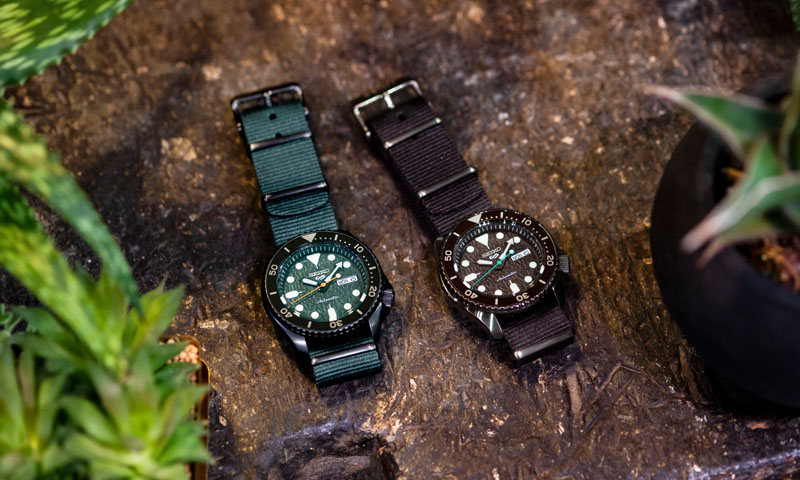
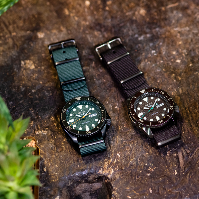
Matsue: Ito-san, you have past experience in designing products other than watches. From my perspective, based mainly on watch design, it was quite unexpected that you brought a plant-related idea for a watch. I was very surprised when I heard your proposal.
Ito: A watch is an industrial product, but I thought it would be nice to give it an organic feel, in spite of the use of metals, by leveraging colors and finishing textures. I was also very particular about selecting the colors of the nylon straps.
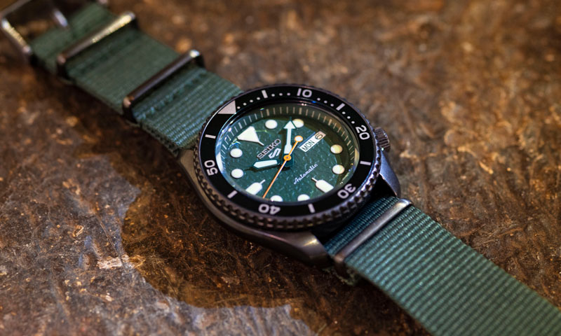
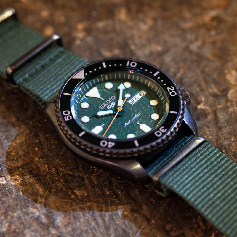
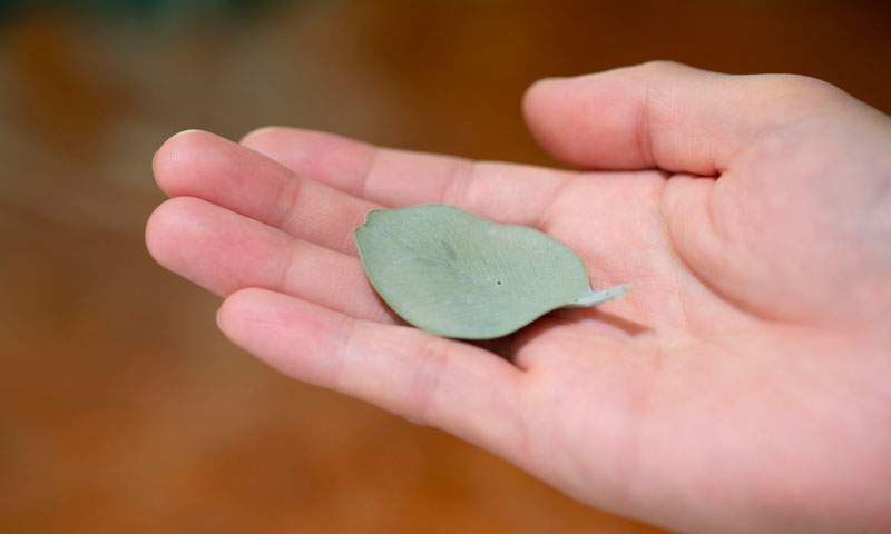
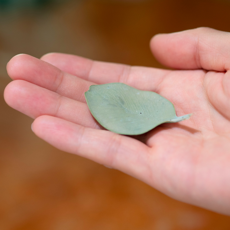
Goda: I thought the products had a feel of comfortable humidity, even though they are watches. Also, I think they suit Ito-san’s own image very well.
Ito: I actually do grow plants myself. I remember when we had meetings I brought leaves and dried nuts as reference materials along with my ideas.
Watches that feel both nostalgic and new.
Matsue: In this launch, we released 27 models. Kawamura-san, are there any models that made an impression on you?
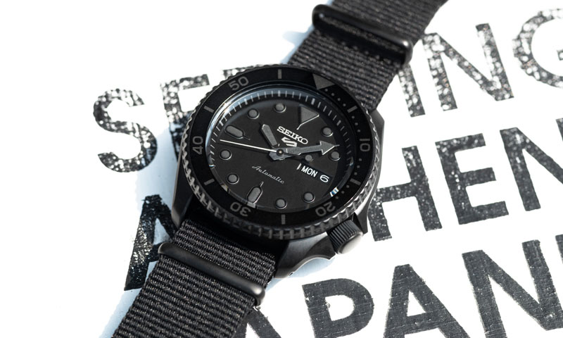
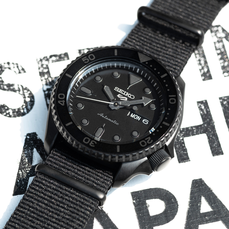
Kawamura: Of the watches in the Street style, I designed the watch in which both the dial and indexes are black (SRPD79K1). If we had to follow the Seiko diver’s watch standards, I would have been unable to produce it because it wouldn’t meet the standards for legibility and so on. Of course, if all parts were completely black, it wouldn’t even have met the requirements for legibility as a watch, so I selected the colors of each part while ensuring it still met the minimum requirements for legibility.
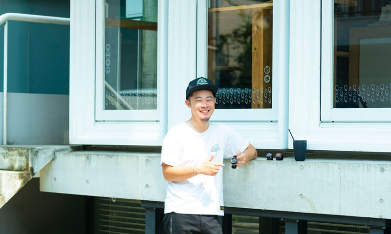
Kawamura joined Seiko in 2013 and has been on the design team for Seiko brand watches destined for the European and American markets. Today he mainly designs products for the Japanese market.

Kawamura joined Seiko in 2013 and has been on the design team for Seiko brand watches destined for the European and American markets. Today he mainly designs products for the Japanese market.
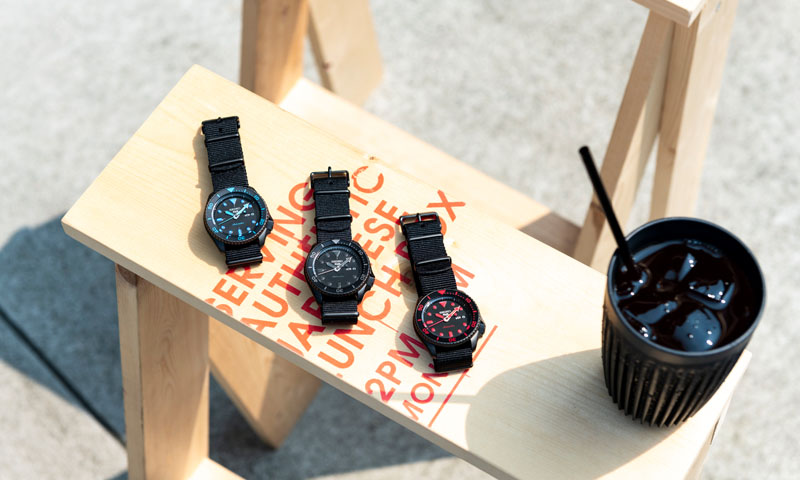
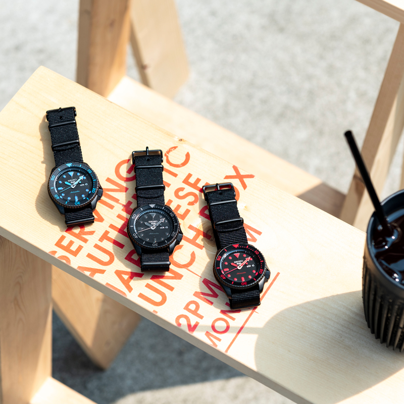
Matsue: Among the SKX series, which is the origin of these watches, there was already a model with a black dial and bezel nicknamed Black Boy, right?
Kawamura: Right. I kept that model in mind and looked for ways to make the blackness even more prominent. I took a risk in making even the indexes black, and now I think it was a good idea because it’s like the design represents the streets of Tokyo today.
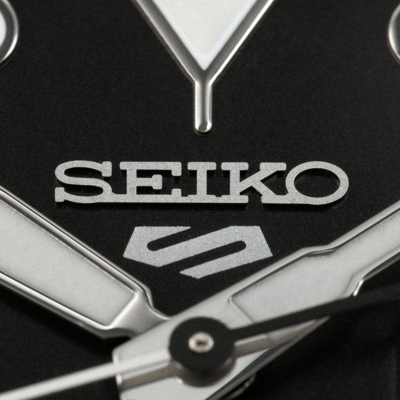
Matsue: Through this rebranding, we carefully considered the new logo, the store fixtures, and even the product tags, to build up a world view of the new Seiko 5 Sports. Most of those investigations were led and carried out by young members, so we think that these watches will touch the hearts of the same generation, the millennials. For the logo in particular, we spent a lot of time redesigning the number 5 mark which has been so beloved for many years.
While showing our respect for the former number 5 emblem, we wanted the new logo to be something that could be reproduced by anyone using a marker or a stencil like tagging (spray-painted street art) seen on a street corner. Also, the edges of the logo form a pentagon that represents each of the styles, as well as our hopes for various cultures to interact with each other through the Seiko 5 Sports. With that in mind, this logo was finally completed as a symbol with a double meaning that can be perceived as both a “5” and an “S” as in the initial character of Sports and Style.
Matsue: The new Seiko 5 Sports presents style options based on the 5 Styles, but there are just as many styles as there are people, and this is also an era in which a person may lead a lifestyle in which they adopt several styles. It would be great if the new Seiko 5 Sports becomes entrenched as one of the items that express young people’s personalities in different situations according to the change of the times.


