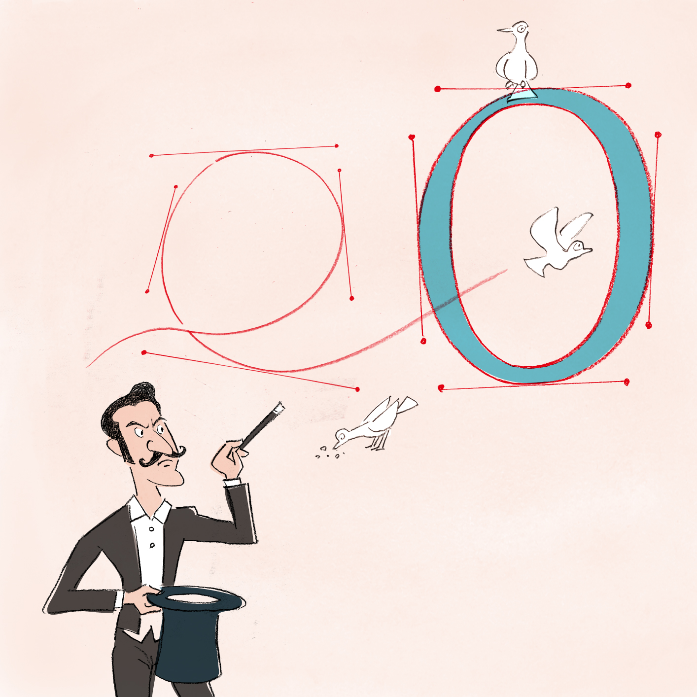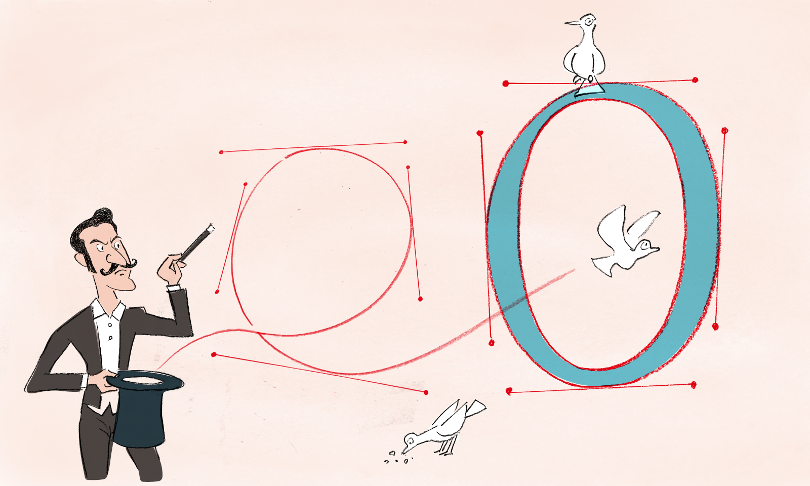


The origin of Seiko’s typeface design
To begin with, the predecessors of Seiko’s watch designers were dial artwork and layout designers and exterior designers. The job title that we now call “watch designer” originated from the position of the person in charge of design in a team mainly in charge of production and design organized in 1956. It seems that the people who filled this position were the first true watch designers in Japan.
From 1900 to around the 1950s, most watch cases had simple designs with two standard lugs. Since the movements were standardized, there was little difference in the structure and shape of the case, and the watch band was often replaced with a strap or bracelet of the user’s liking in the store, with no emphasis placed on the official product. So, inevitably, much of the designer’s work at the time was dial design.
Perhaps it is because of this historical background that Seiko’s watch designers have inherited the company’s obsession with dials as part of their DNA. So in this edition, I would like to take a closer look at the “unknown” techniques of detailing for the purpose of “looking natural without any incongruity,” while citing specific examples.

Kamata joined Seiko in 1996 and began designing watches for the global market. He spent some time stationed in Italy and now works as Design Director of Grand Seiko. To date, he has worked on the Brightz and Astron collections.

Kamata joined Seiko in 1996 and began designing watches for the global market. He spent some time stationed in Italy and now works as Design Director of Grand Seiko. To date, he has worked on the Brightz and Astron collections.
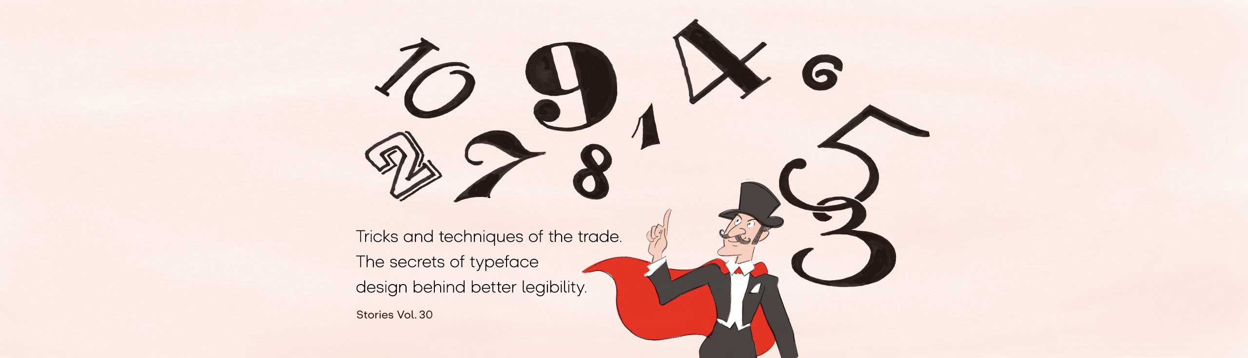
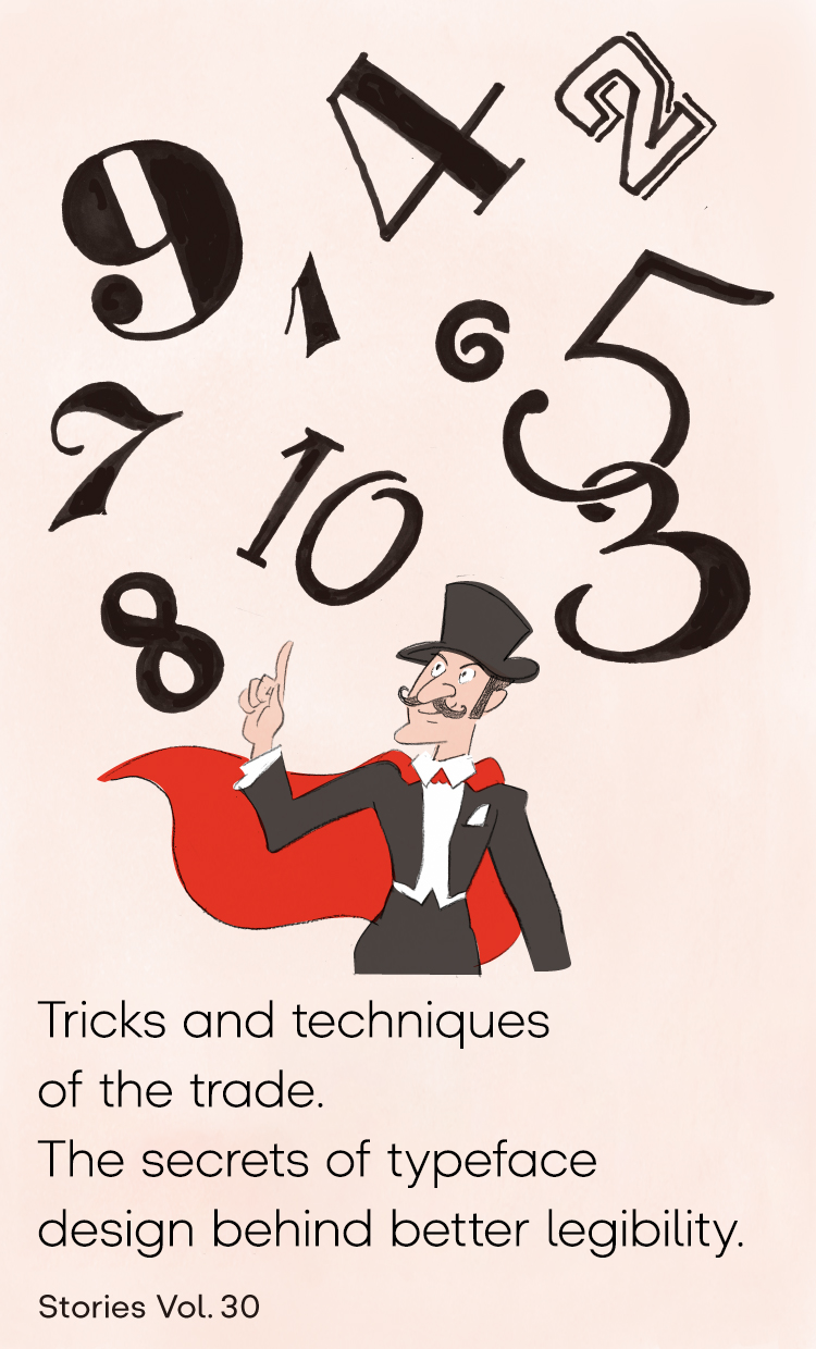
The secret techniques for “easy-to-read characters”
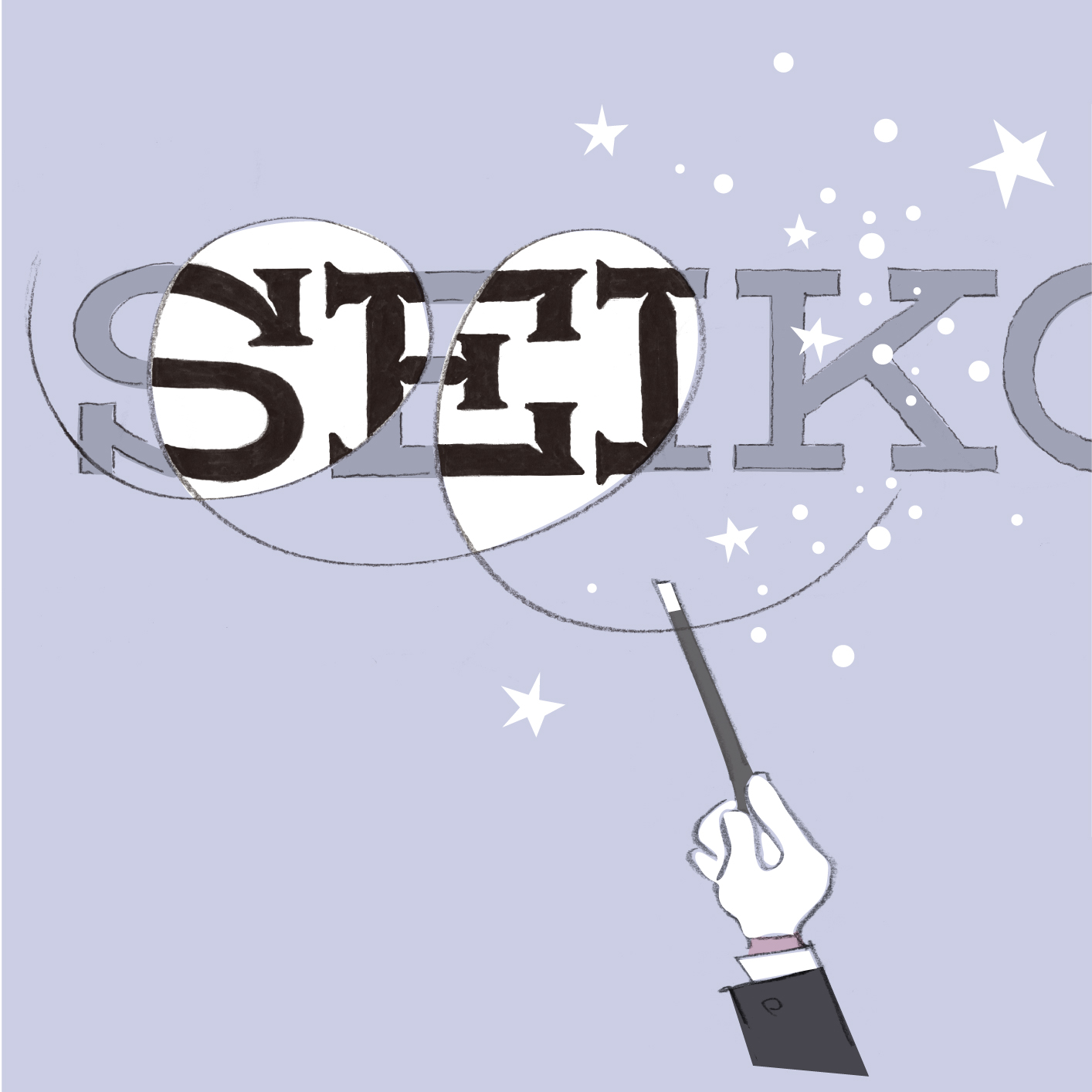
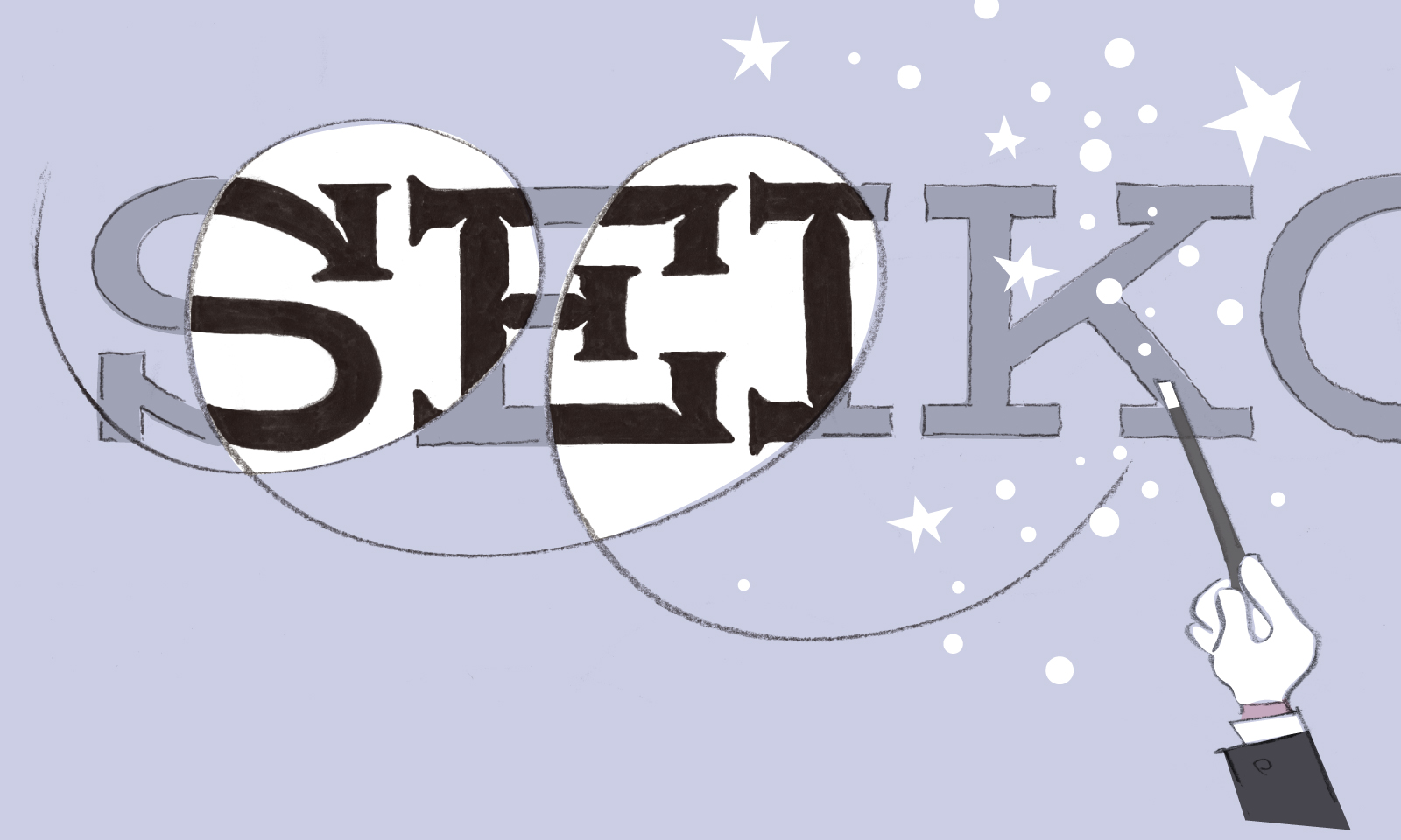
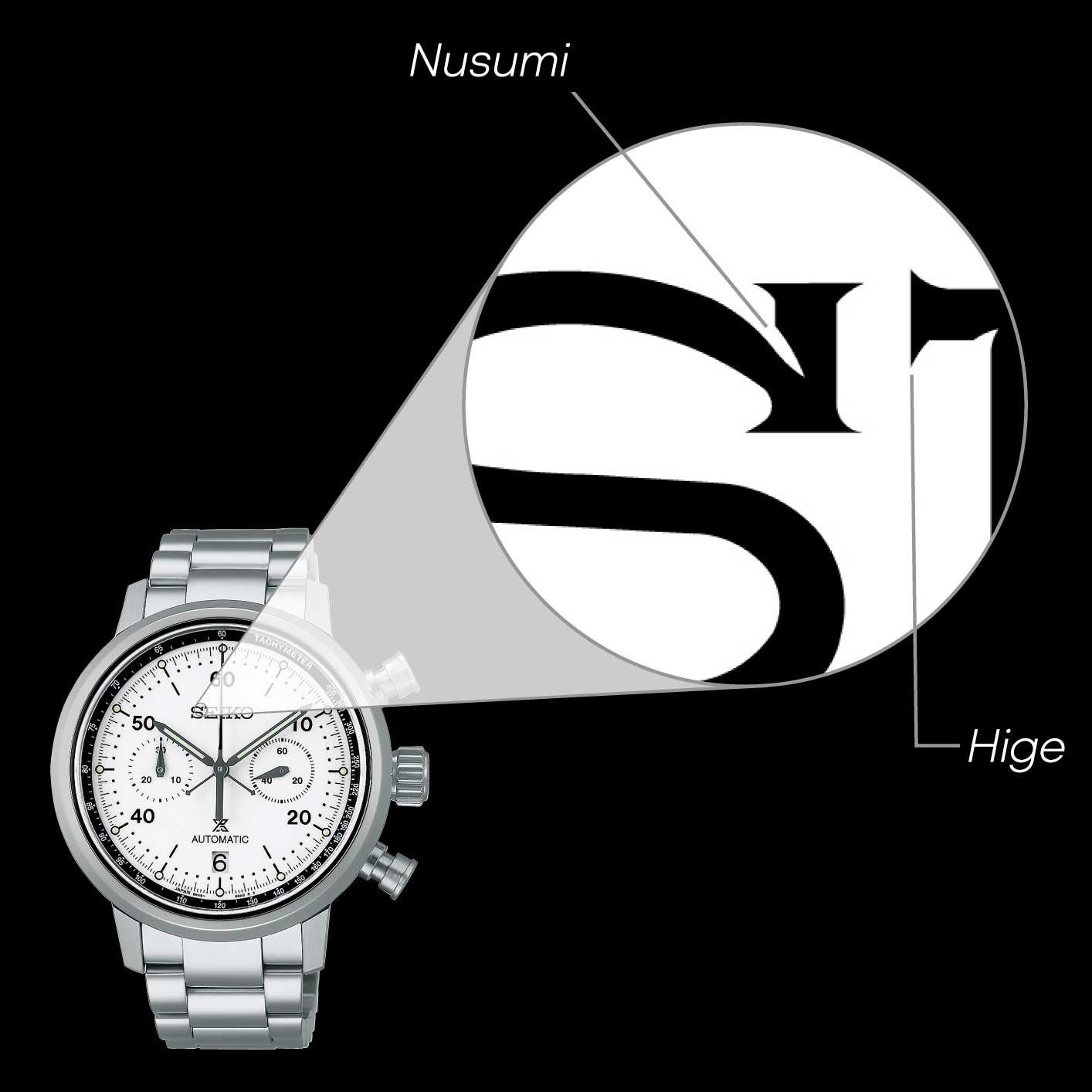
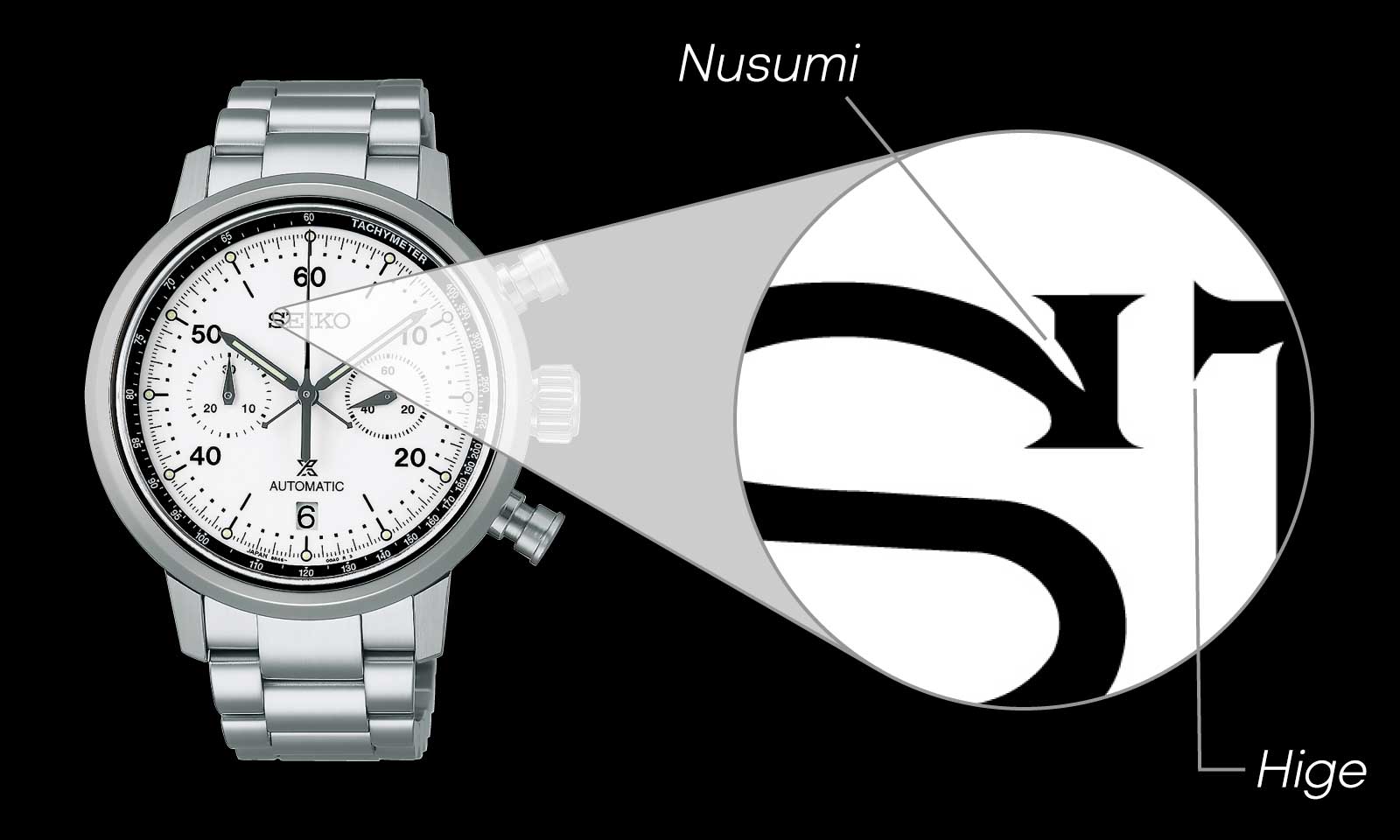
Before examining the characters on a watch, let’s consider the Seiko logo, which is the face of the brand, as an example. If you look at the letter S, you will see that the corners of the letter have sharp, protruding edges. In Seiko, we call this part Hige (which is derived from the Japanese word “mustache” and means “serif” in English), and this technique has the effect of making even small letters appear crisp and clear.
You can also see that there is a kind of slit at the border between the vertical line and the curve. We call this Nusumi (which is derived from the Japanese word “steal”), and this technique allows us to give a crisp look to the corners of the letters.
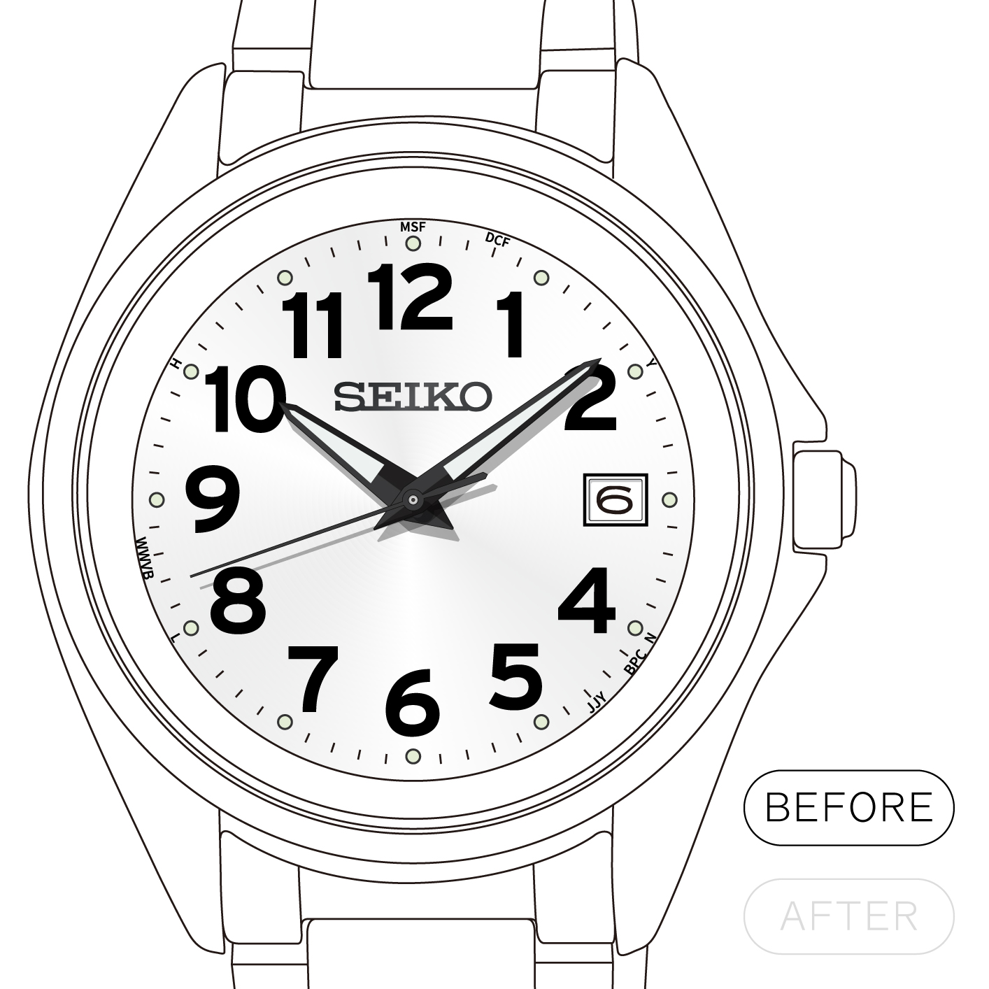
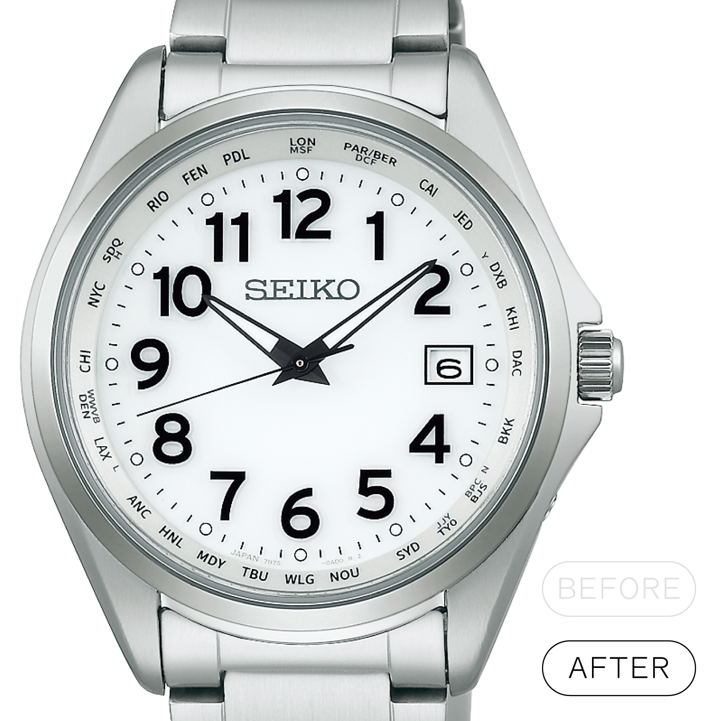
These techniques are also used for numerals. For example, Roman numerals, which are often seen on dressy watches, are sometimes given a slightly stronger Hige to give them a more elegant look. The Roman numerals on this Lukia watch have been given more exaggerated Hige to create the impression of numerals written with a fountain pen, with the direction of the penstroke in mind.
Moreover, the Roman numeral “X” actually conceals a trick that you probably would not normally notice. The trick is in the point where the lines cross. The “X” comprises a thick line intersecting a thin line, which, due to the nature of human vision, appears to be slightly out of alignment if left as is. The sense of misalignment is calculated for and the thin lines on either side are adjusted to make them appear to be aligned. It would be almost impossible to notice this trick in ordinary life.


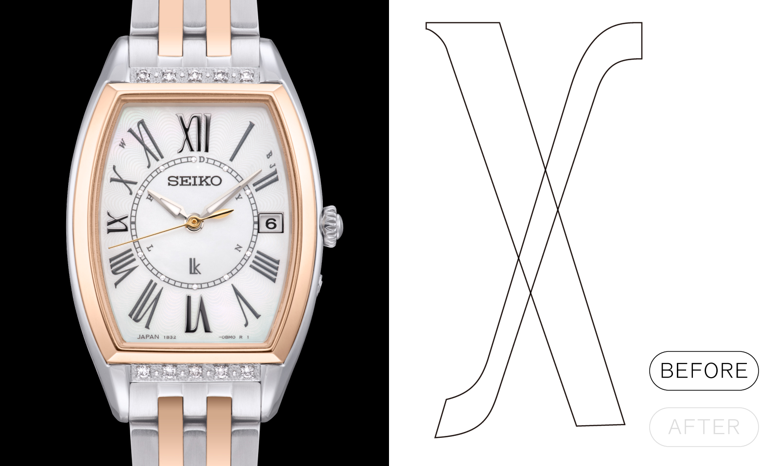
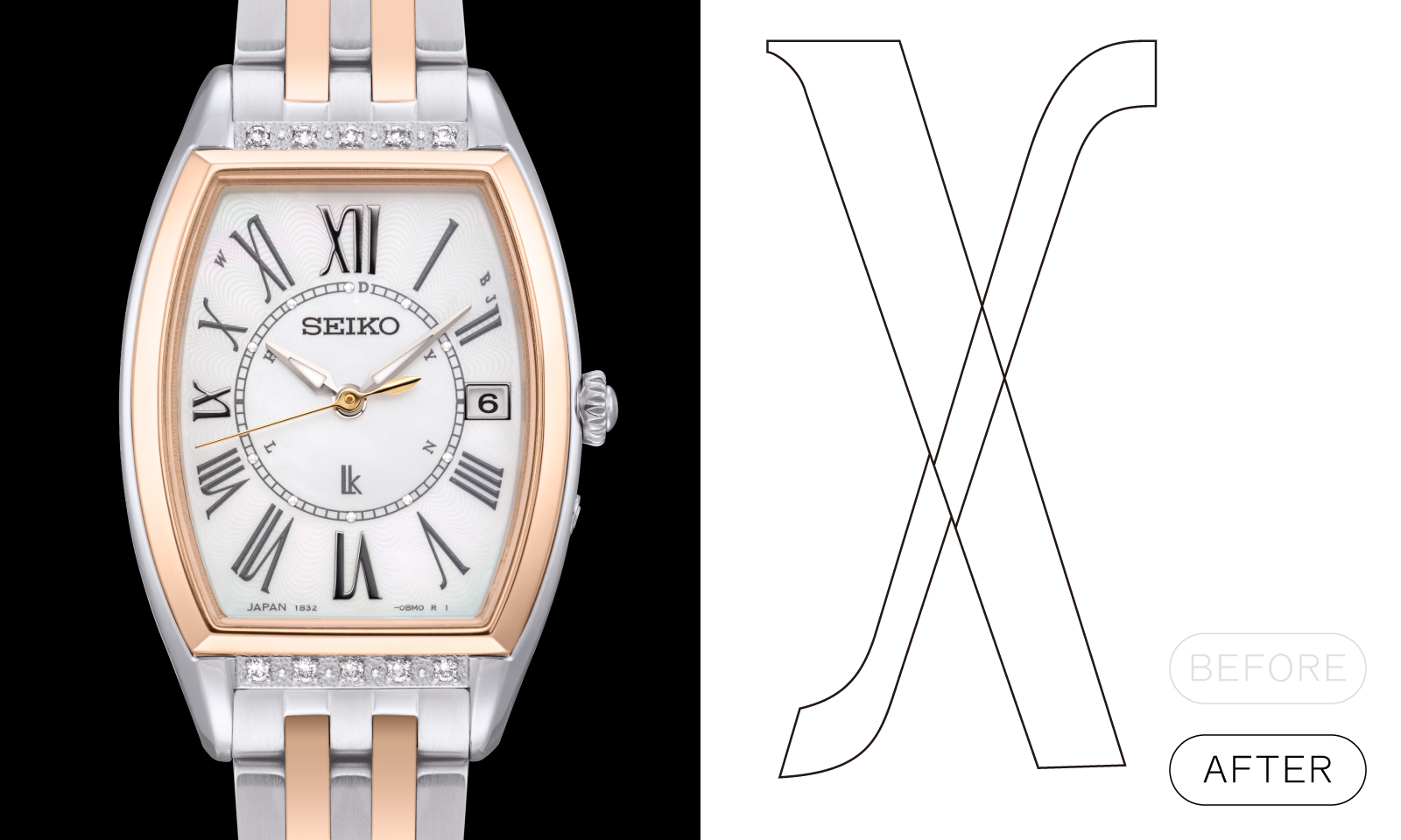
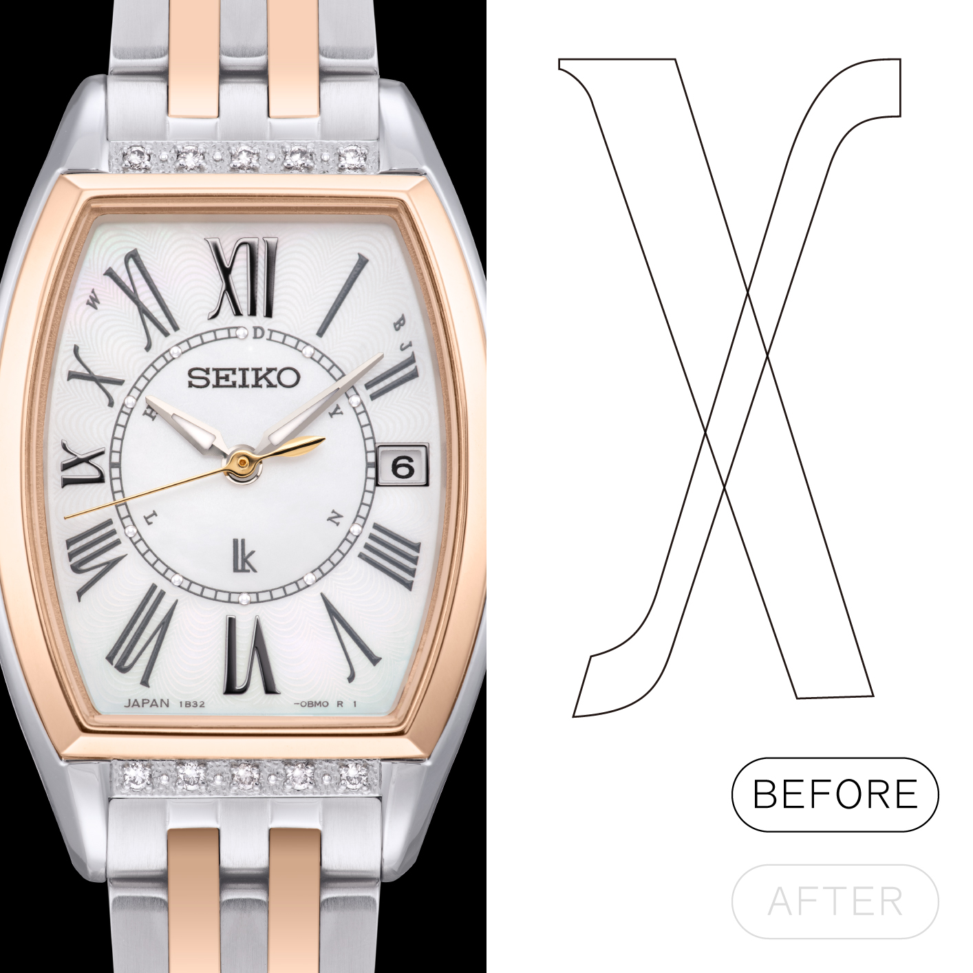
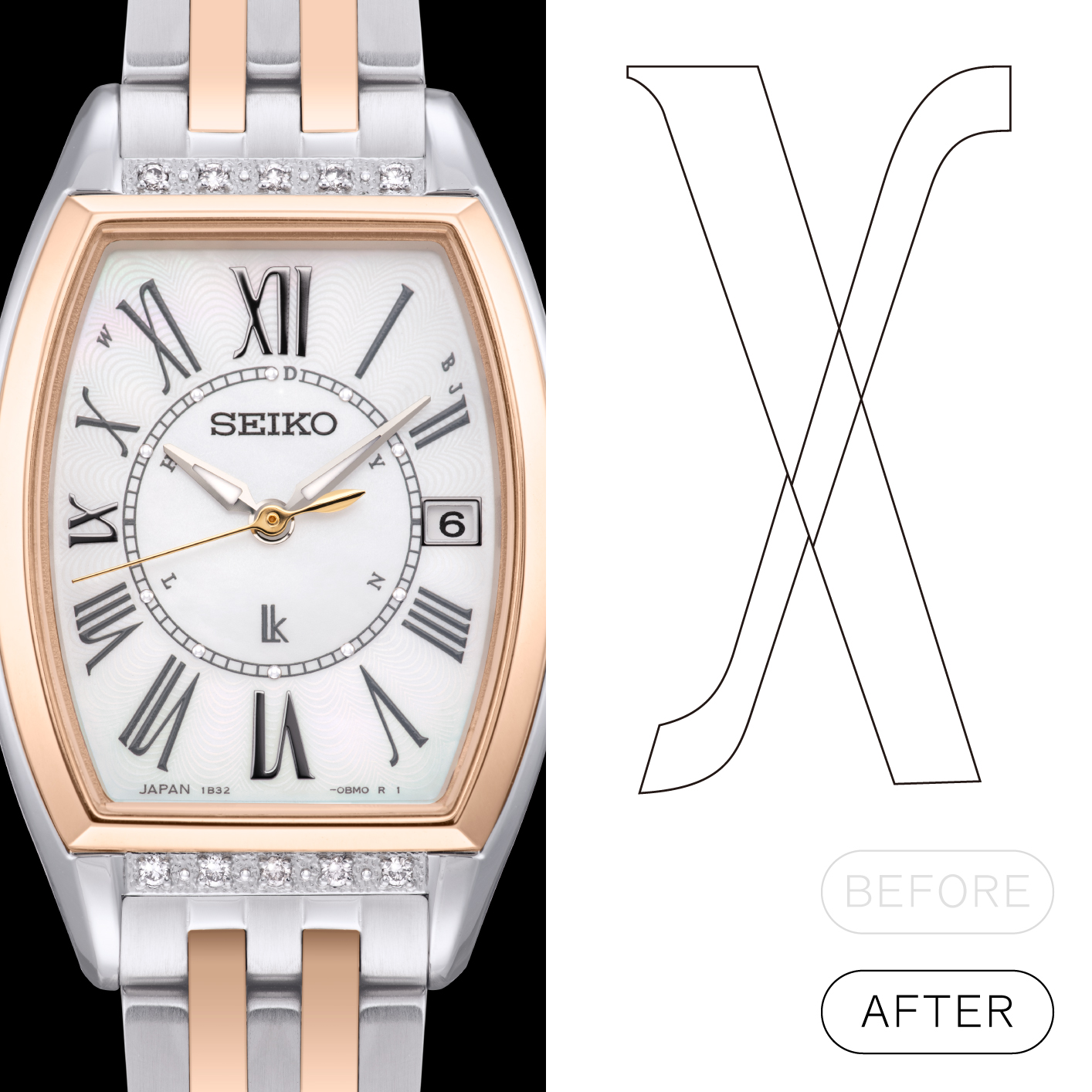
LUKIA (SSVW180J) with original typeface design. The diagonal lines appear to be straight, without any sense of incongruity, due to the correction of slightly shifting the lines at the intersection.
The secret behind “looking normal”
Next, let’s look at the placement of letters. To look “normal” means looking natural, without any sense of incongruity. What we need to be aware of in order to achieve this is, after all, the importance of placing the numerals comfortably within the 12 divisions. It is no exaggeration to say that watch designers are, in particular, locked in a battle with the circular shape of the dial.
Let’s take a look at a watch with Arabic numerals as an example. Although it is a little bit like playing Spot the Difference, compare the rendering that was first created by a young designer with the design that was further refined with the aid of a senior designer and finally commercialized. Don’t you think the Arabic numerals are arranged more comfortably in the final design? You can appreciate the extraordinary effort and experience of the designers behind achieving a normal, natural look.
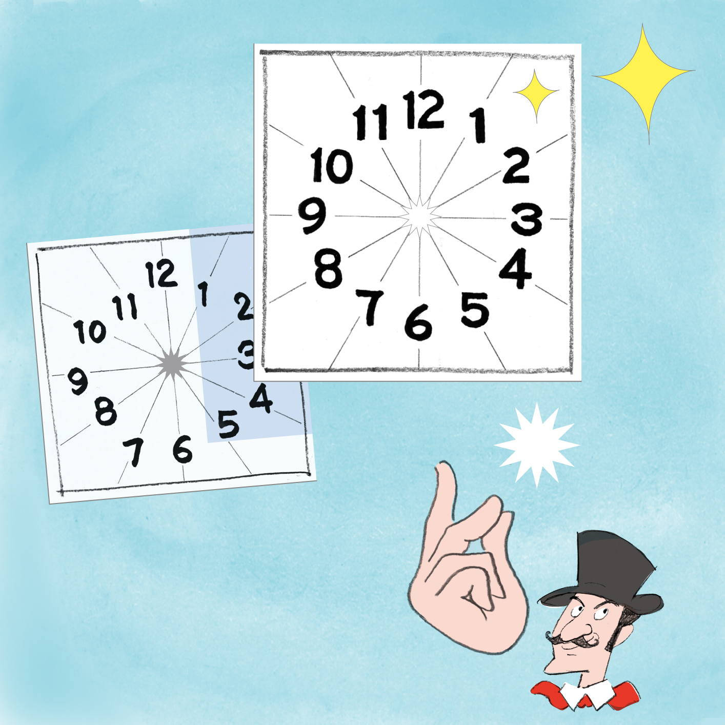
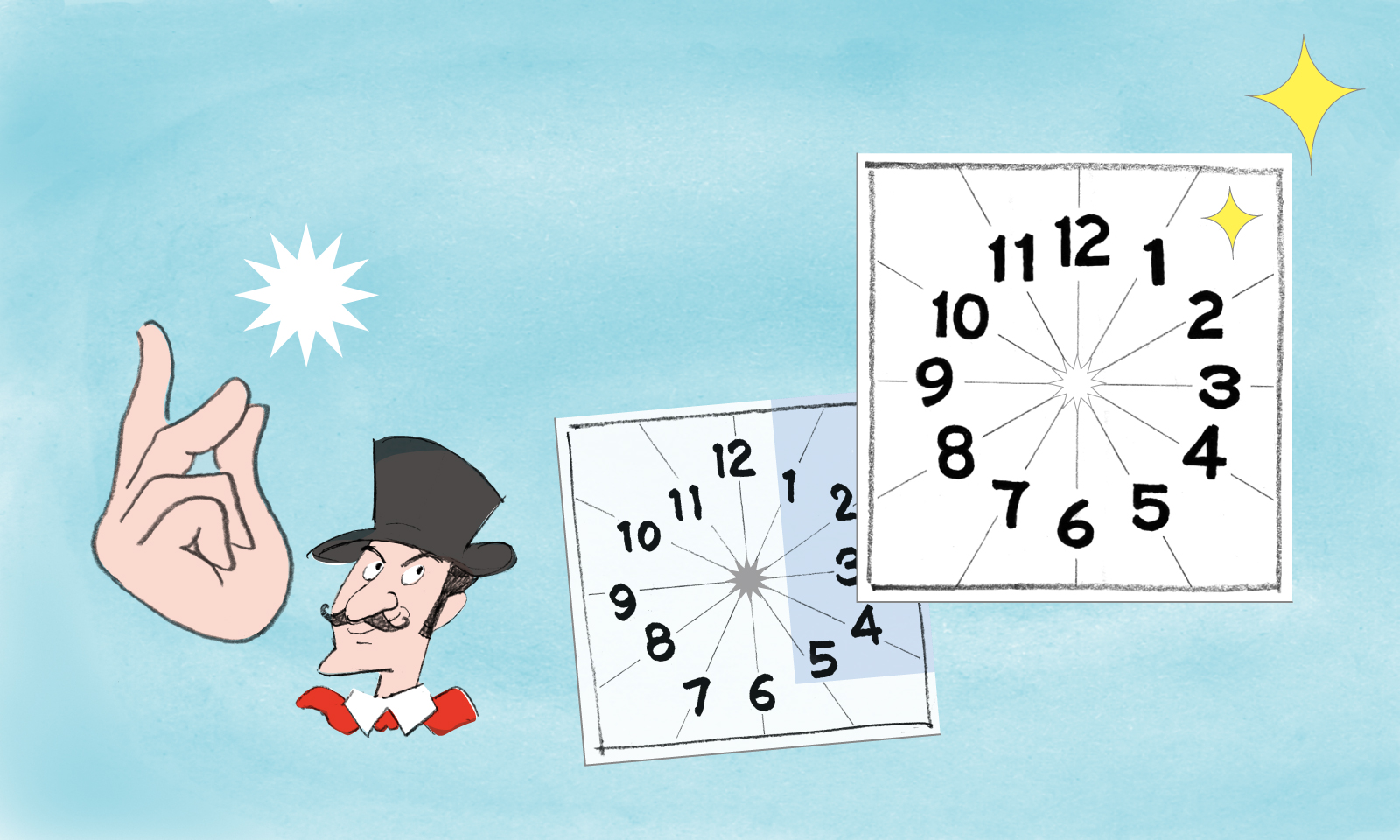
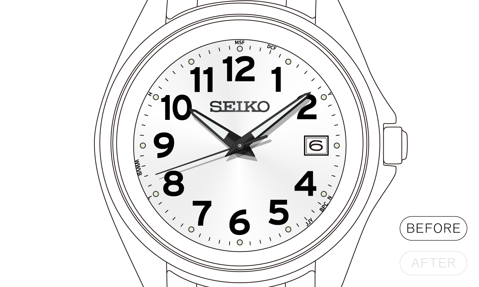
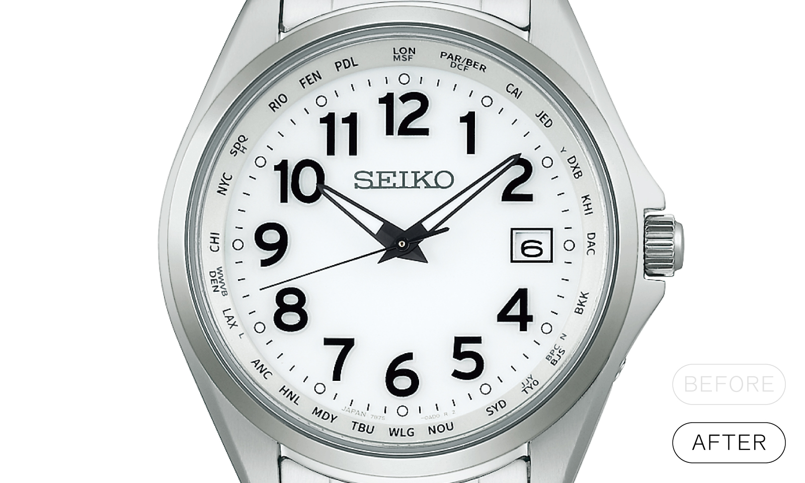
Although ever so slight, the adjustments made through the senior designer’s advice clearly impart a better balance to the layout.
The Arabic numerals placed on rotating bezels also employ a certain trick. If we take out a pair of these Arabic numerals and position them upright, we see that the two numerals are very slightly tilted outward from each other. This is due to another optical illusion of the human eye. If we were to place pairs of Arabic numerals on the circumference without making this adjustment, they would appear to tilt slightly inward. Correcting for this is one of the essential points for making the numerals look normal.


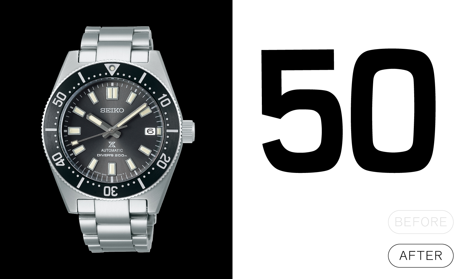
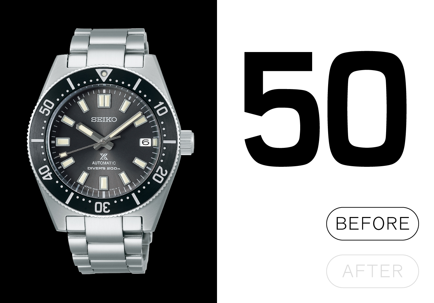
The numerals on this Prospex (SBDC181, available only in Japan) are ever so slightly tilted to give them a well-balanced appearance. If you take a look at your own watch, you may find that there is a correction technique applied to it as well.
Illusion correction: “Do you really need to go that far?”
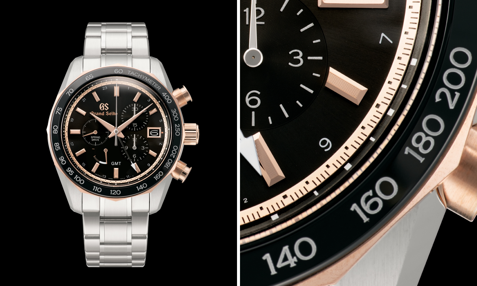
Since we’ve come this far, let’s take a look at some final examples of correcting for optical illusion, which might make you think “do you really need to go that far?” The positioning of numerals explained in the previous section is an indispensable process to make them look natural. On the other hand, the use of Hige (serif) and Nusumi explained in the first section can be considered a matter of the designer’s preference as a technique to make the numerals easier to see. One of the most prominent examples of this can be seen in Grand Seiko models.
Looking at this SBGC244, we can see that not only the Arabic numerals on the dial, but also the numerals on the bezel have Hige. Furthermore, each of the dial ring markers also have Hige. The effect is only faintly perceptible when looking at the actual product, but it is an expression of the finely honed appearance and sense of precision that is typical of Grand Seiko’s chronographs. It is something like a representation of Grand Seiko’s sense of mission, which embodies “the best of the ordinary.”
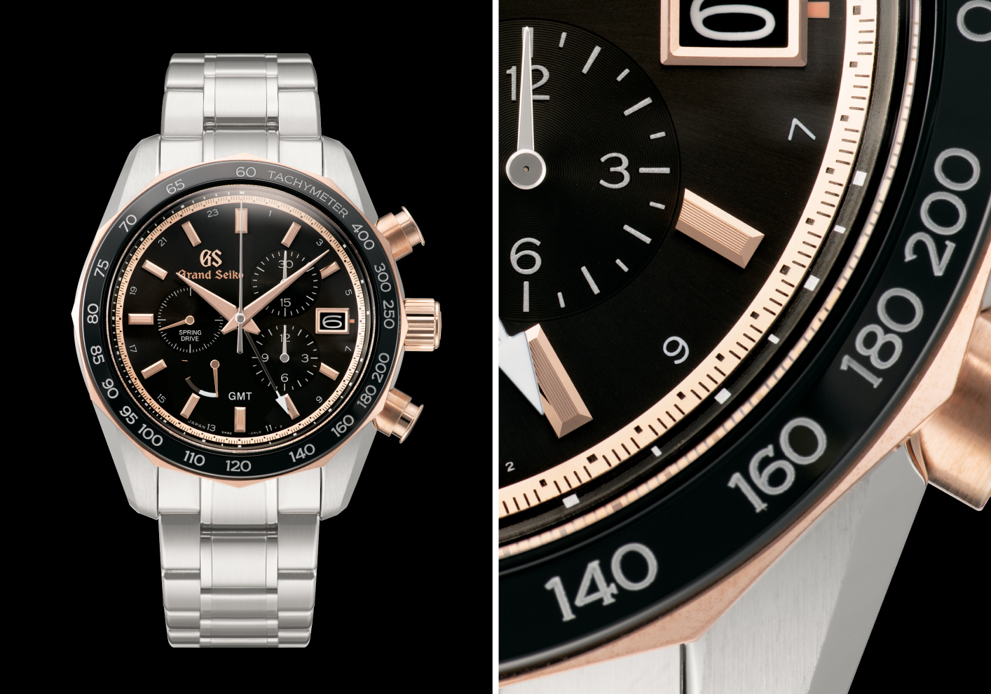
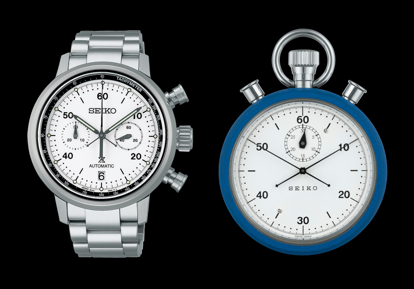
Speaking of a sense of mission, the Prospex Speedtimer series, which pursues the idea of the watch as a measuring instrument, also has a strong sense of mission. The letters in the brand name Seiko are clearly defined with Hige and Nusumi, and the numerals and seconds marker are arranged for an optimal sense of distance and volume. Additionally, the marker uses not only fine lines but also dots. In order to accurately measure athlete’s records, legibility and readability are enhanced as much as possible. It is because a high level of accuracy is required of Prospex watches that we are willing to “go that far.” Or perhaps, in this case, it is more like “we dare to go that far.”

Watch designers’ diligent study continues
The various tricks hidden behind the “normal” look of watch dials have been refined over the course of Seiko’s history. Some of them are already established as rules and set as standards, but our designers continue to hone their skills day by day in order to further evolve Seiko’s expertise and expand the possibilities of watch design.
Young designers and even senior designers who have been with the company for many years learn and discover new things every day as they design watches. There is no end to the evolution of design. This is both a challenge and the best part of being a designer.